A fence is a divider: Not only does a fence divide a space into two distinct physical areas, it also creates a dynamic between those two. Whichever side you’re on, dictates your relationship to the fence, and to the space on the other side of it. There is always an inside and an outside, something to be protected and something to be repelled. You either can’t enter, or you can’t leave.
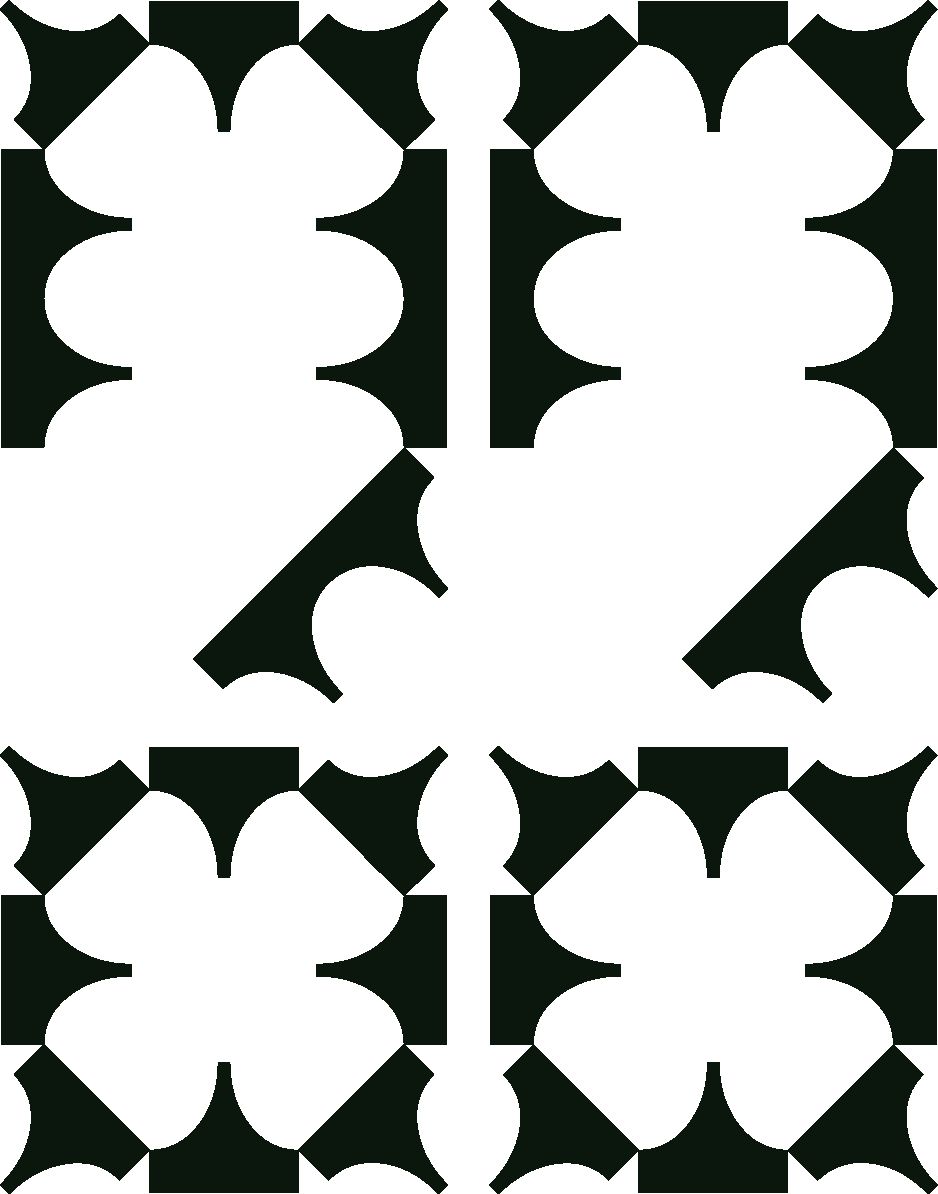
Hera Sans is an experimental typeface inspired by industrial fences, anti-bird spikes and other anti-trespassing architecture. Its name—besides being a beautiful name from Greek mythology—is a tongue-in-cheek reference to a Dutch fence manufacturer.
The typeface navigates the fluid relationship between the two sides of a fence, striking a balance between harsh, sharp thorns and barbs, and pleasing ornaments. It features 81 unique configurations, which gradually increase in intensity.
Now available on jimolijkan.nl