Benn Zorn
Keywords: Typeface, Typedesign, Typography
Internship: School of Life
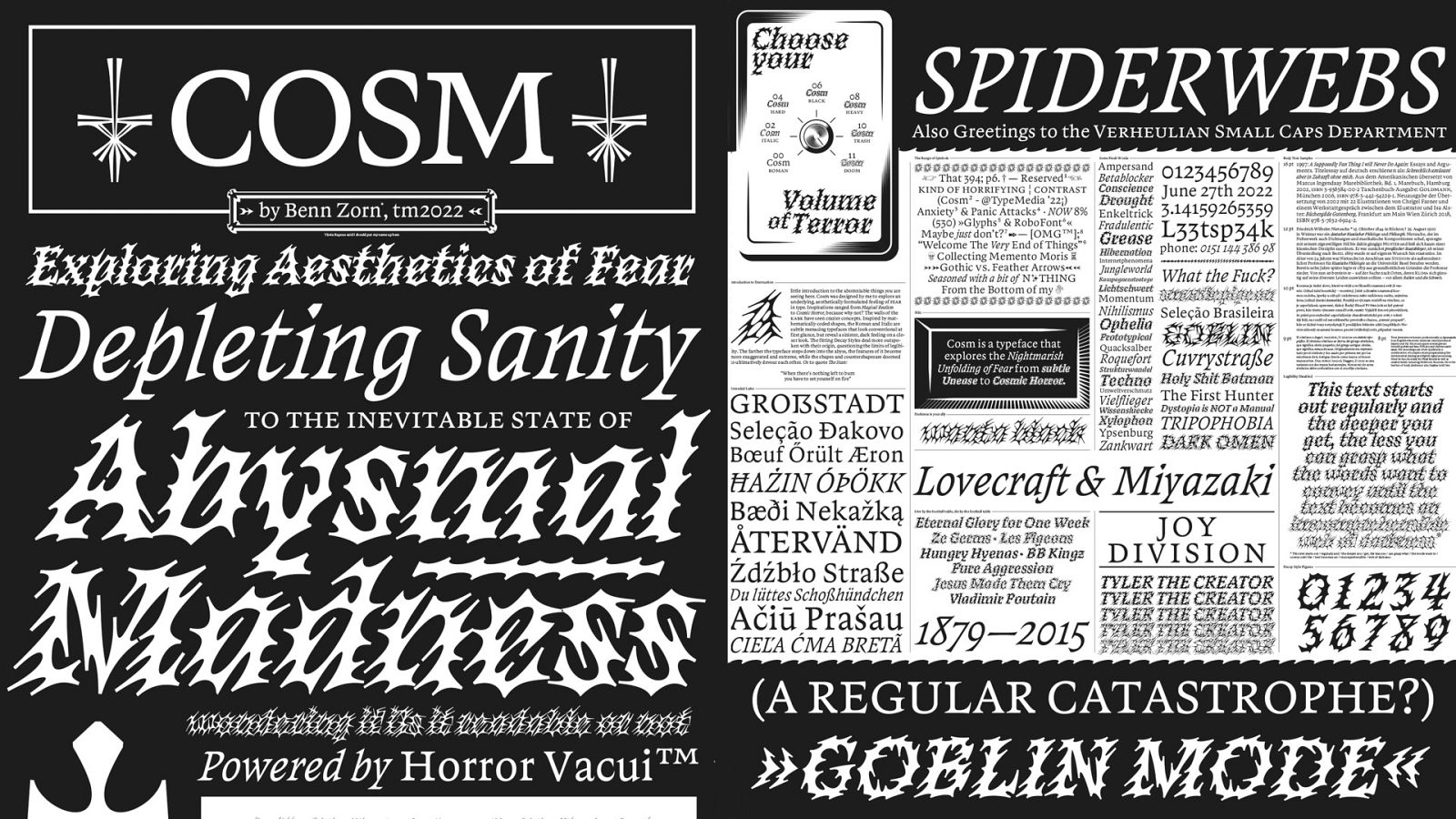
“Cosm” is a typeface designed by Benn Zorn in the Type and Media program 21/22 that explores aesthetical forms of fear from subtle menace to cosmic horror.
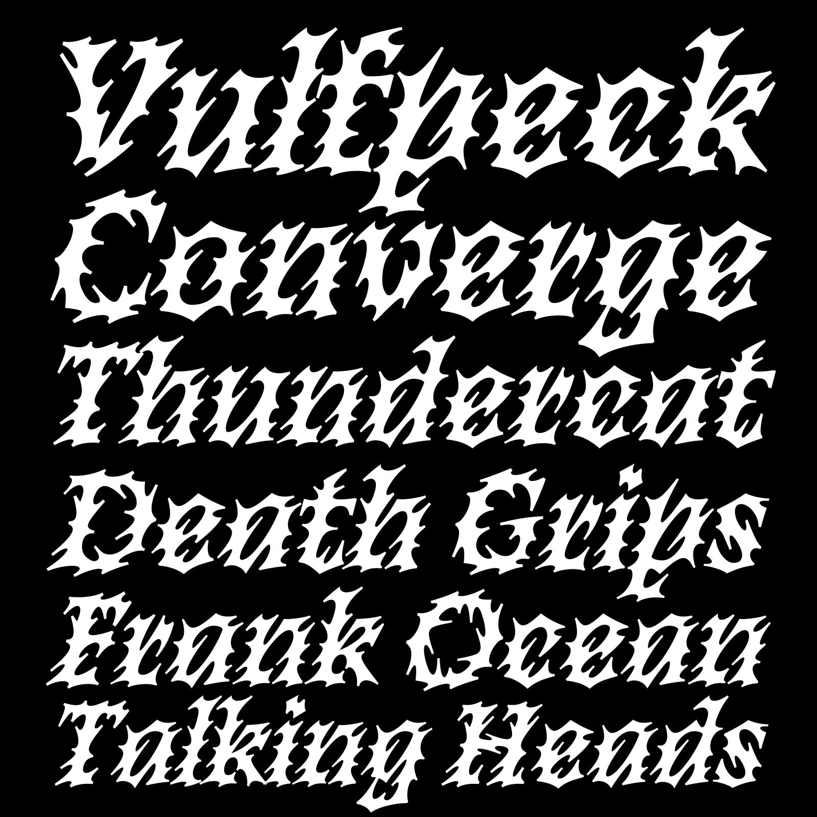

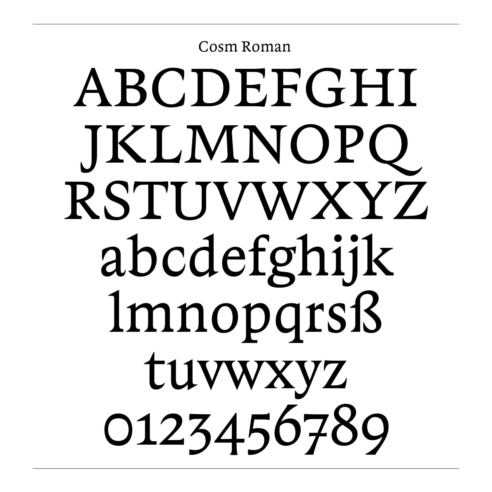
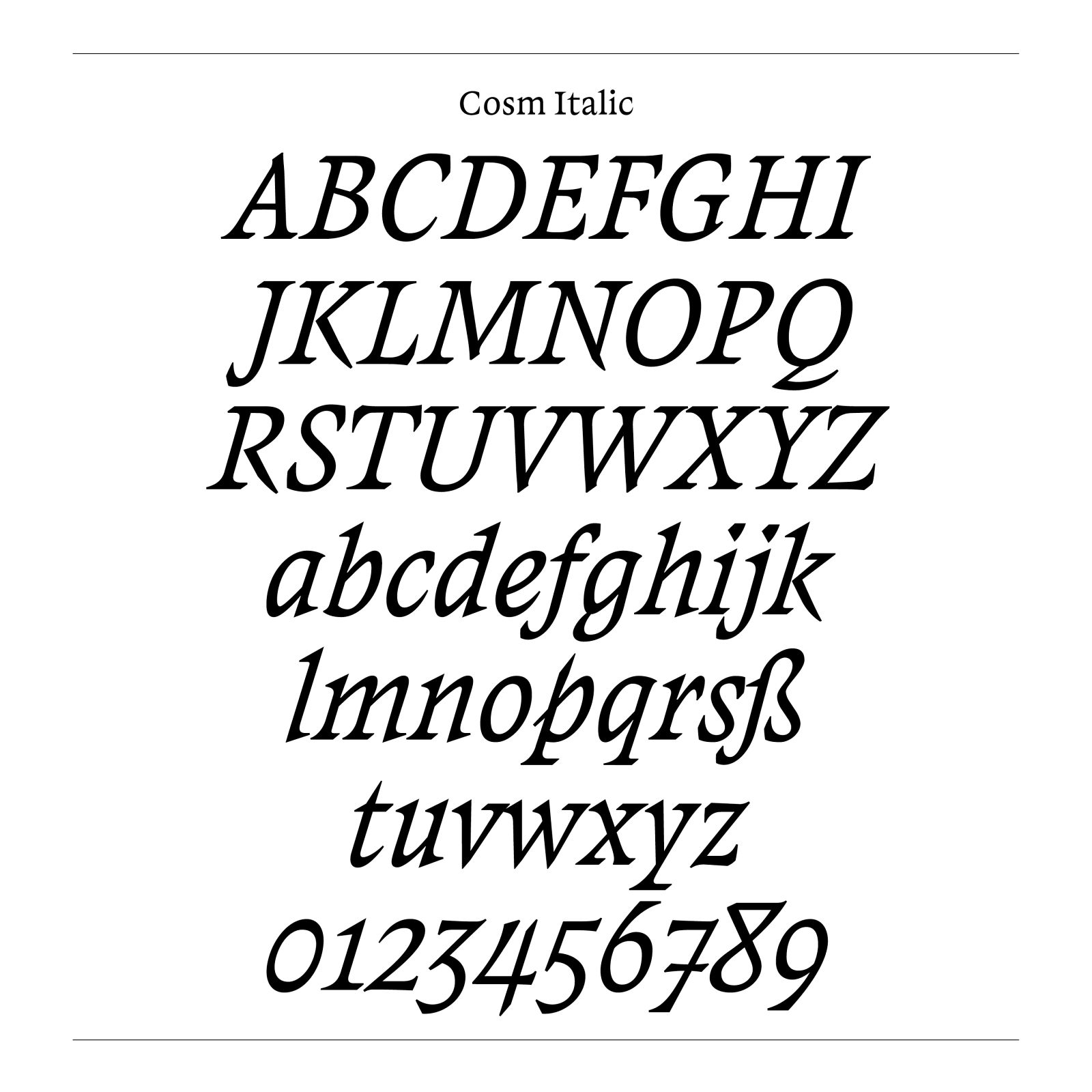
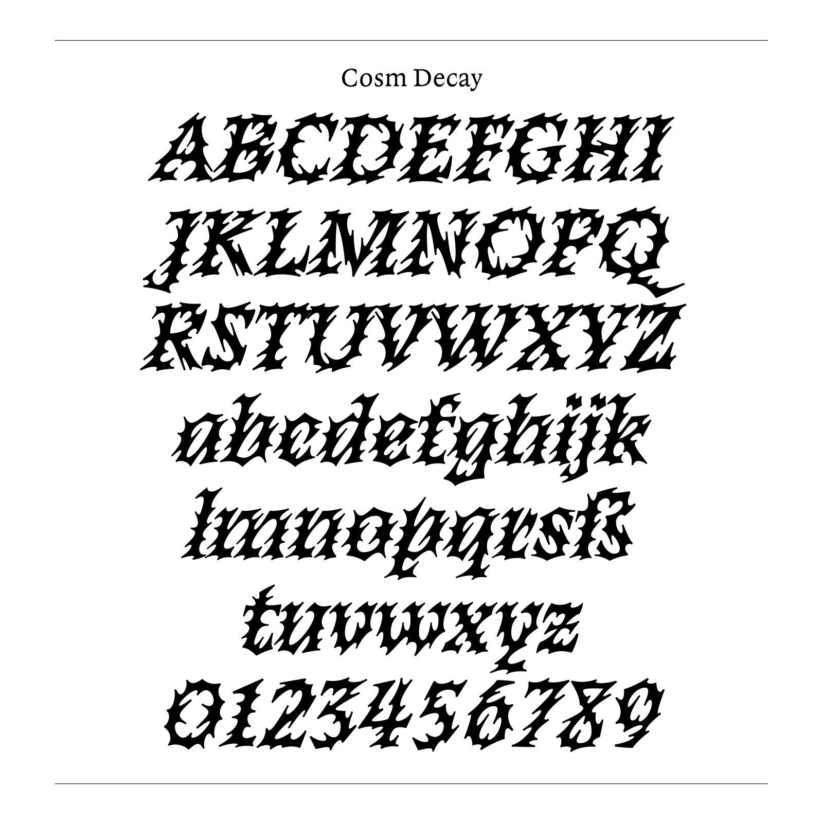
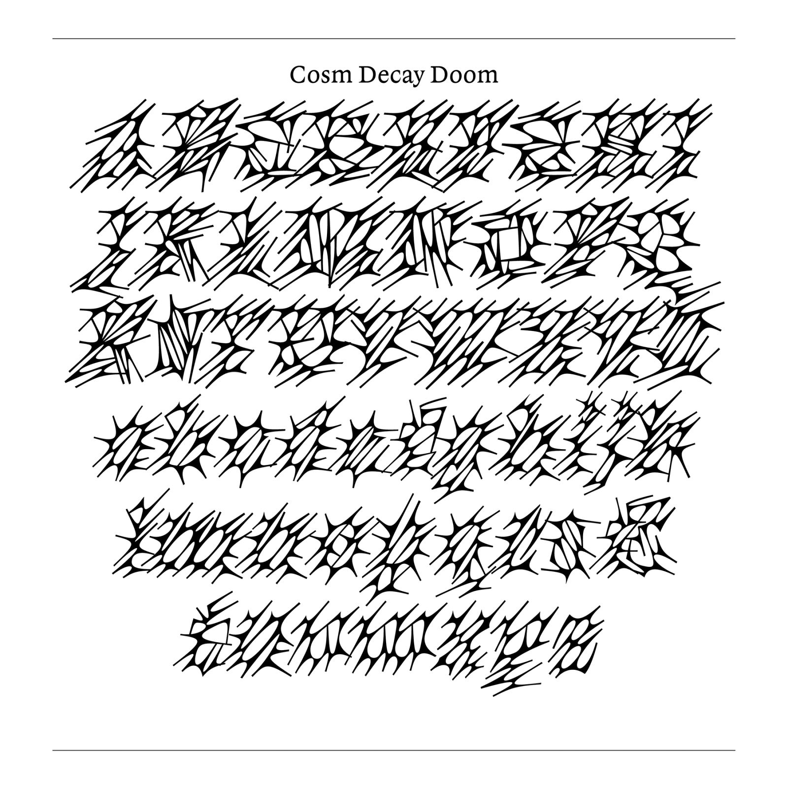
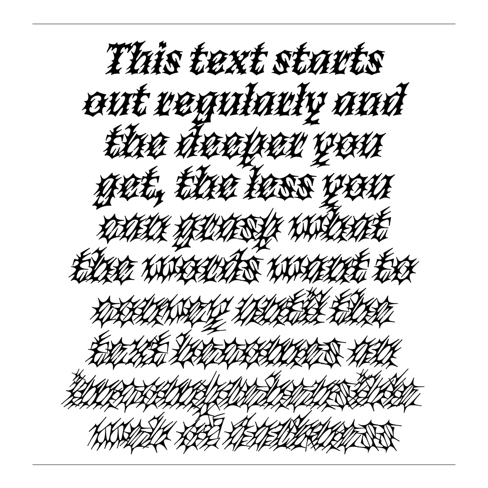
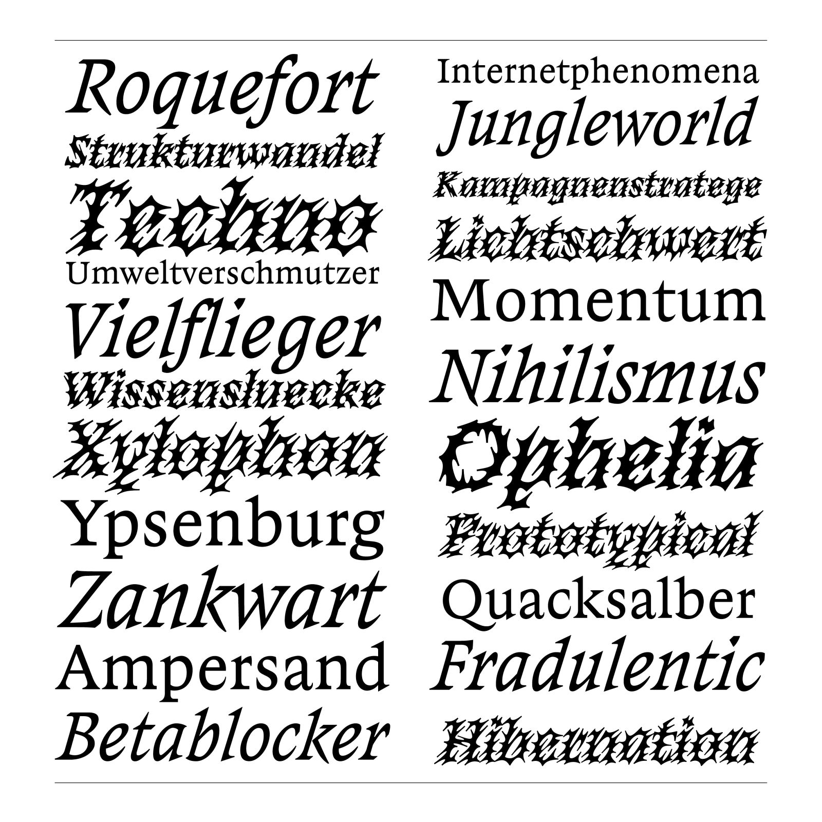
”Cosm“ consists of 4 Masters: Regular, Italic, Decay Hard and Decay Doom. The Decay Styles are fully interpolatable and create a total of five Decay styles, that range from a never seen before, original construction to an illegible web of cellular, slimy structure. While the Regular and Italic work decent as text typefaces and have a broad range of characters, the Decay Styles are primarily made for Display uses. The Italic makes an even couple with he Roman, while being slanted a bit more extreme than conventional and taking some calligraphic freedoms in its shapes.
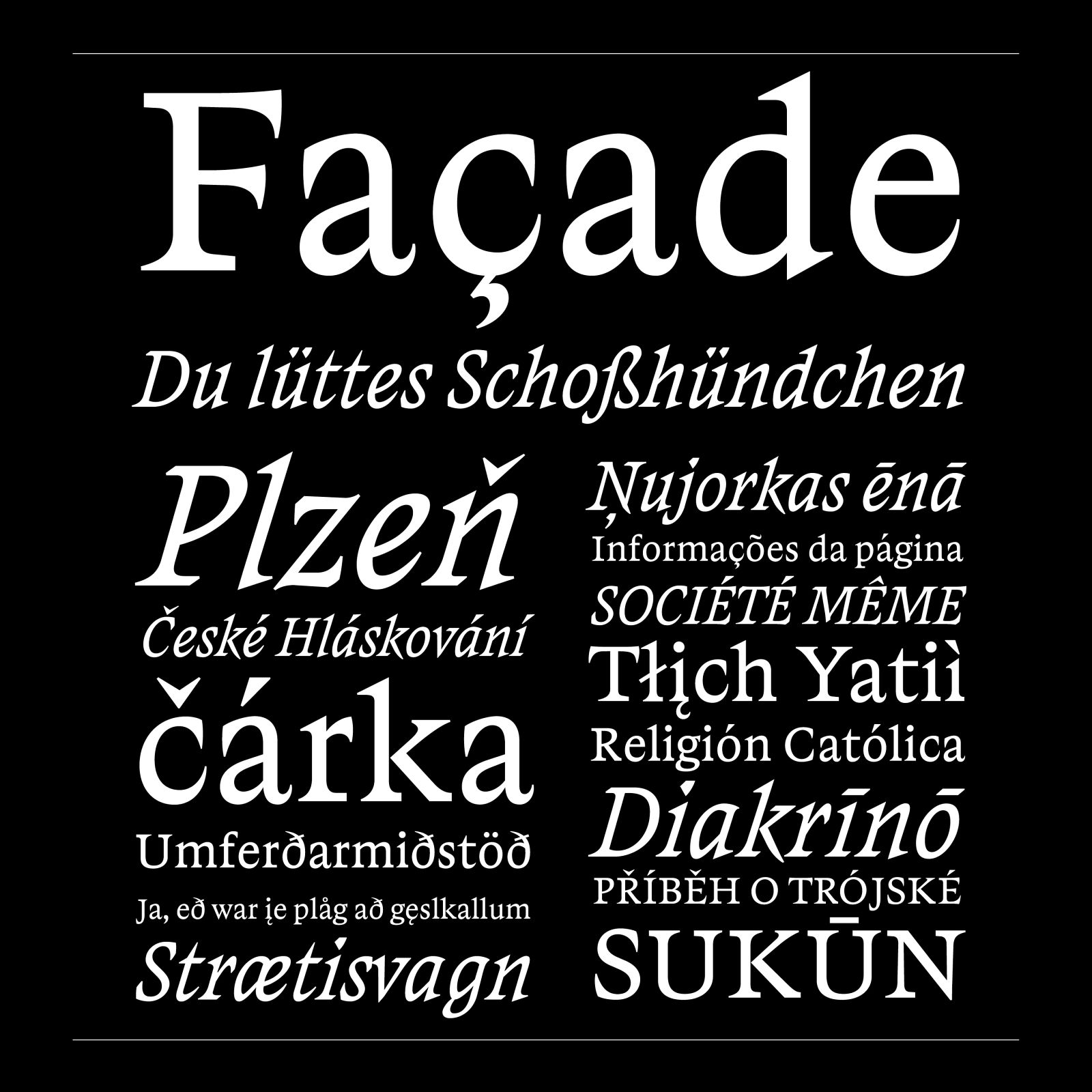
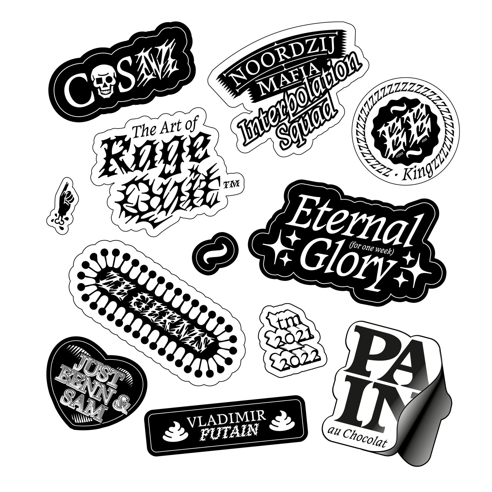
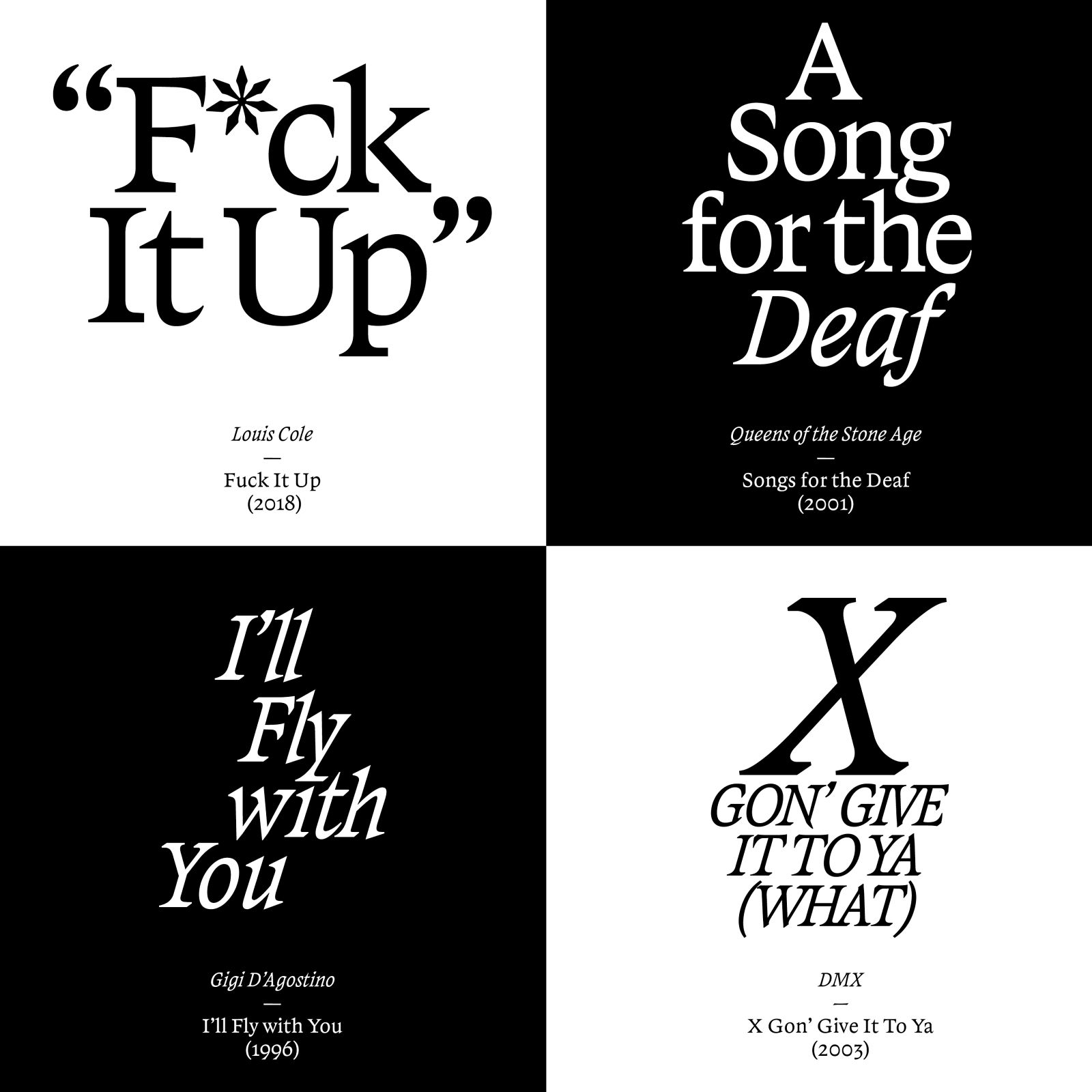
“Cosm” is the result of my effort to create an expression of fear in type, from subtly menacing to lovecraftian, nightmarish and abysmal impressions. To create shapes that convey that spectrum, I explored this territory with drawing and coding simultaneously, always experimenting and looking where he can come up with some truly genuine horrific shapes. While the drawing let me disobey conventions and mix historic construction models, the coding could create an organism-like structure of high complexity in no time. Ultimately, “Cosm” is the result of walking both paths that heavily influenced each other, iterated and refined countless times to make it work as type.
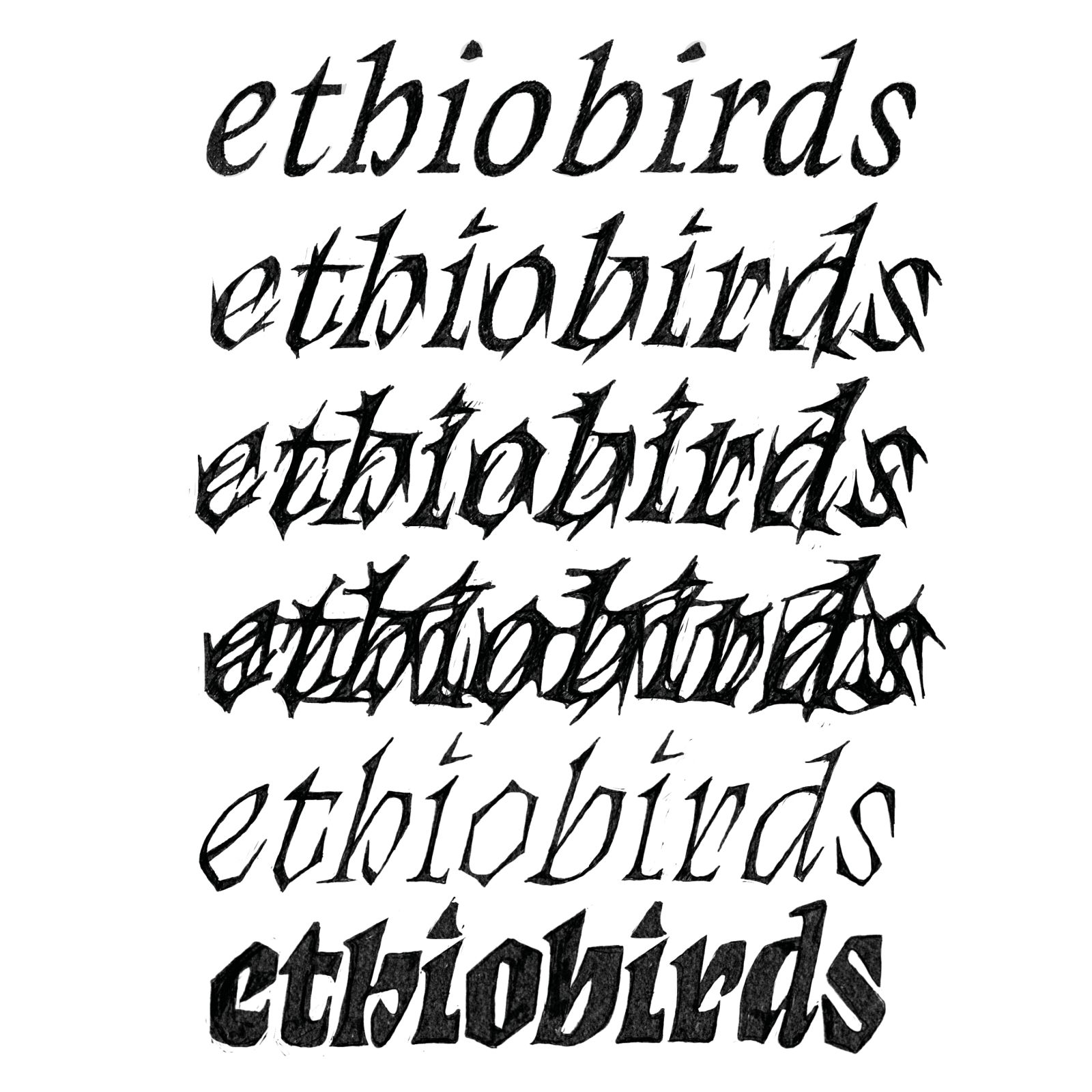
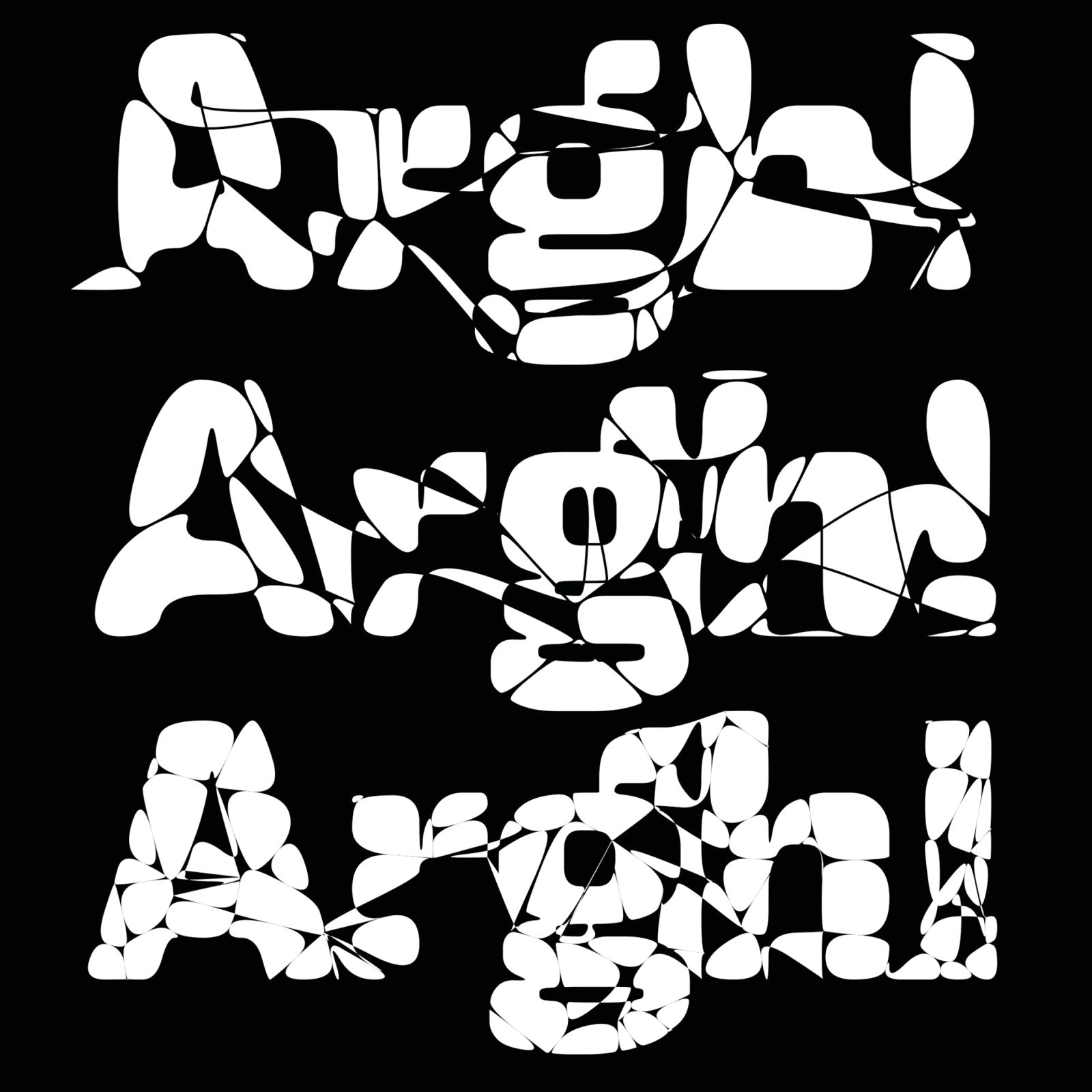
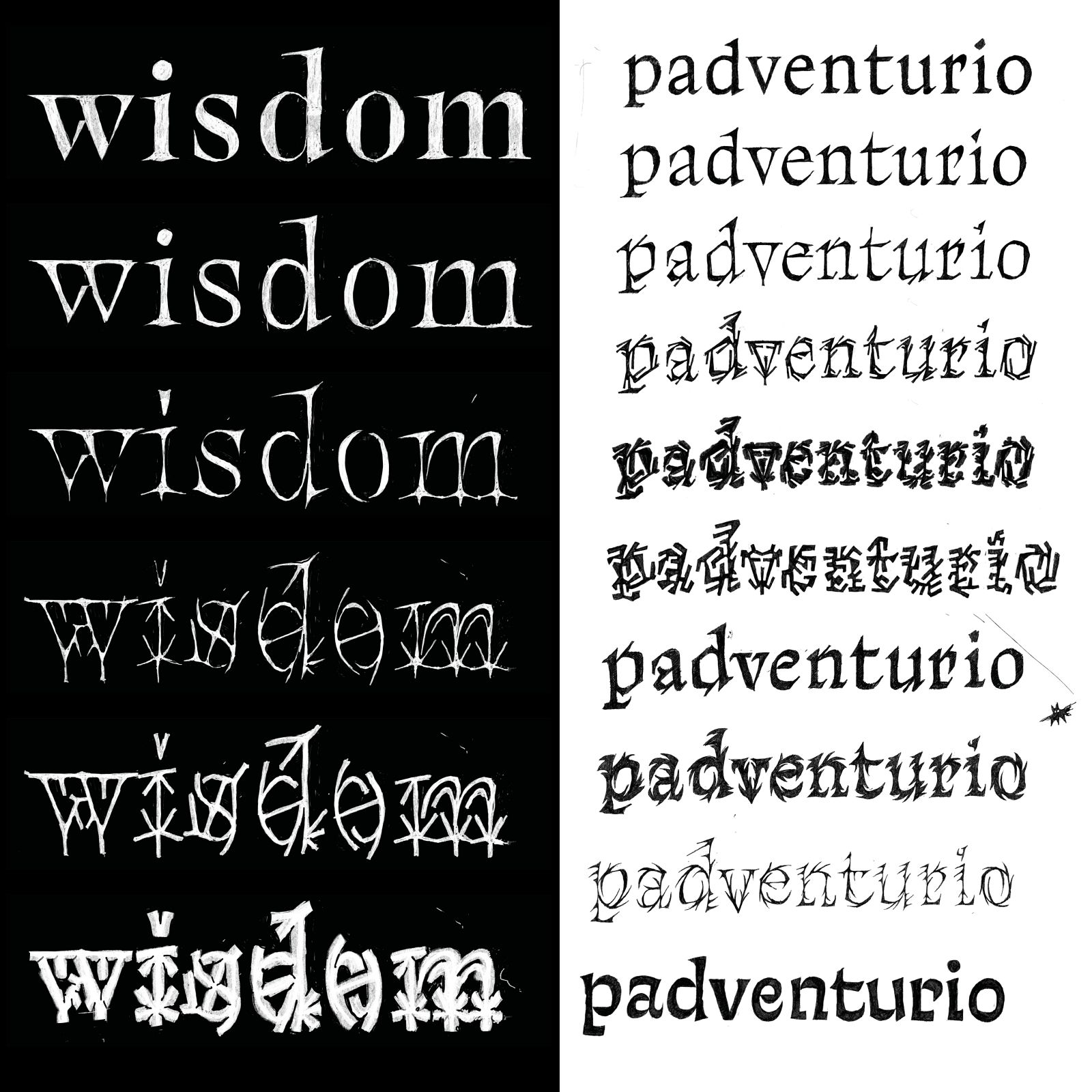
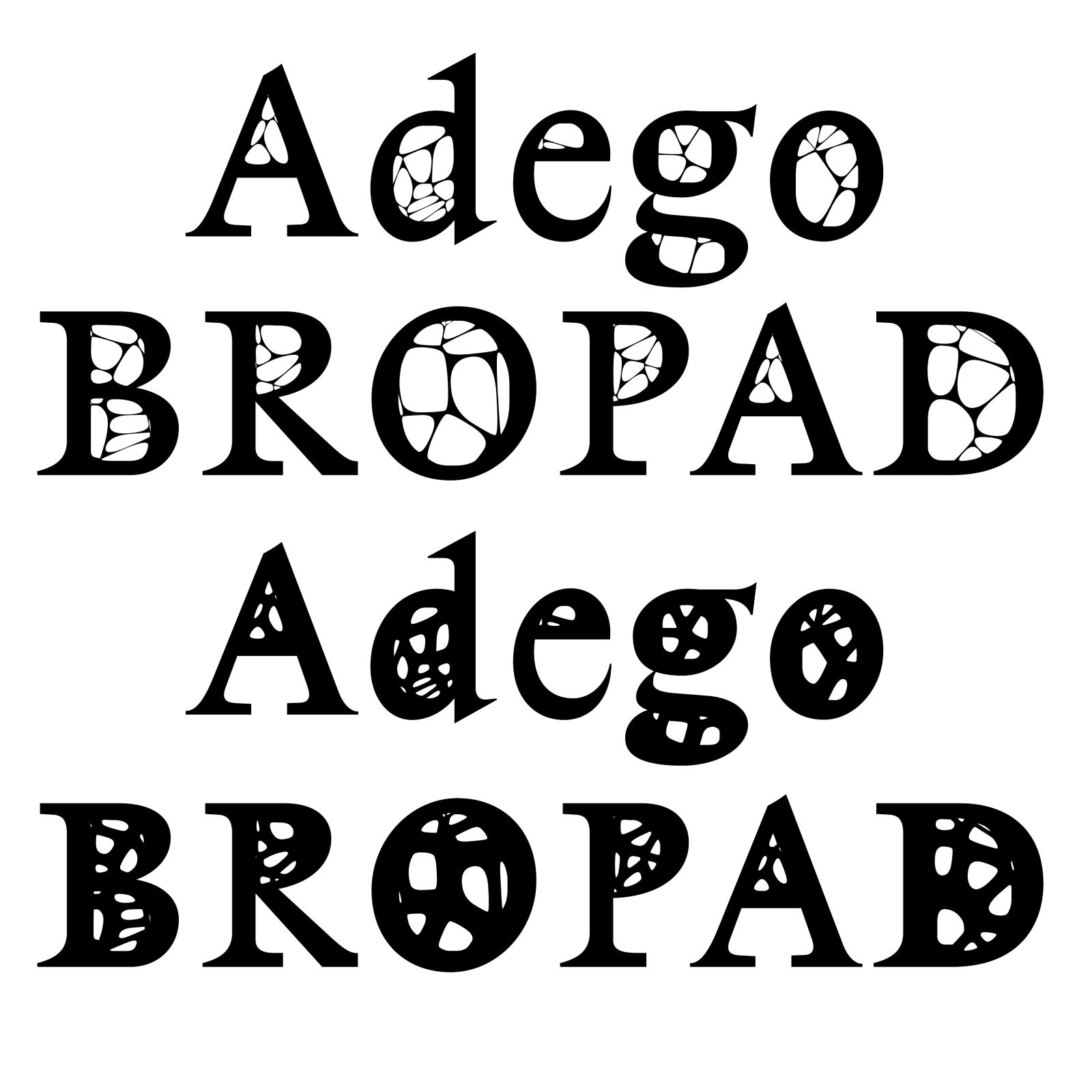
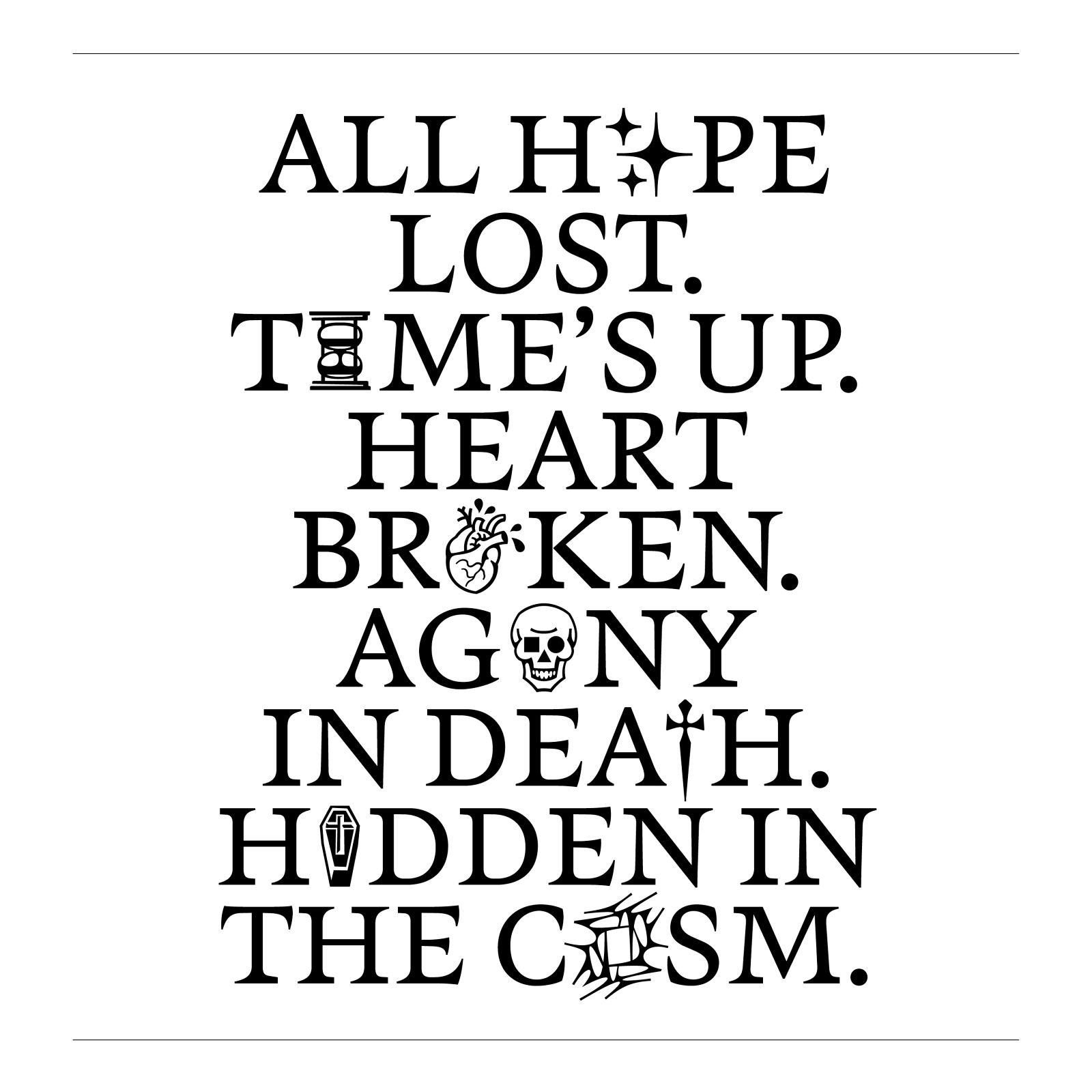
Especially in interpolation one can see how the text mutates from legible to illegible. I also designed some Dingbats to tell a little story and add some contextual feel and humor to the typeface. While the Text styles are versatile, subtle in their terror and can be used for a broad range of editorial work, the Decay Styles are more outspoken and decisive in their appearance.
