Jamie Chang @jamie.type is a Canadian type designer and letterer. Passionate about type, his work delves into the expressiveness and textural qualities of type design. Foosball table oiler, t]m fantasy sumo organizer, and man on the other continent.
GRADUATION PROJECT
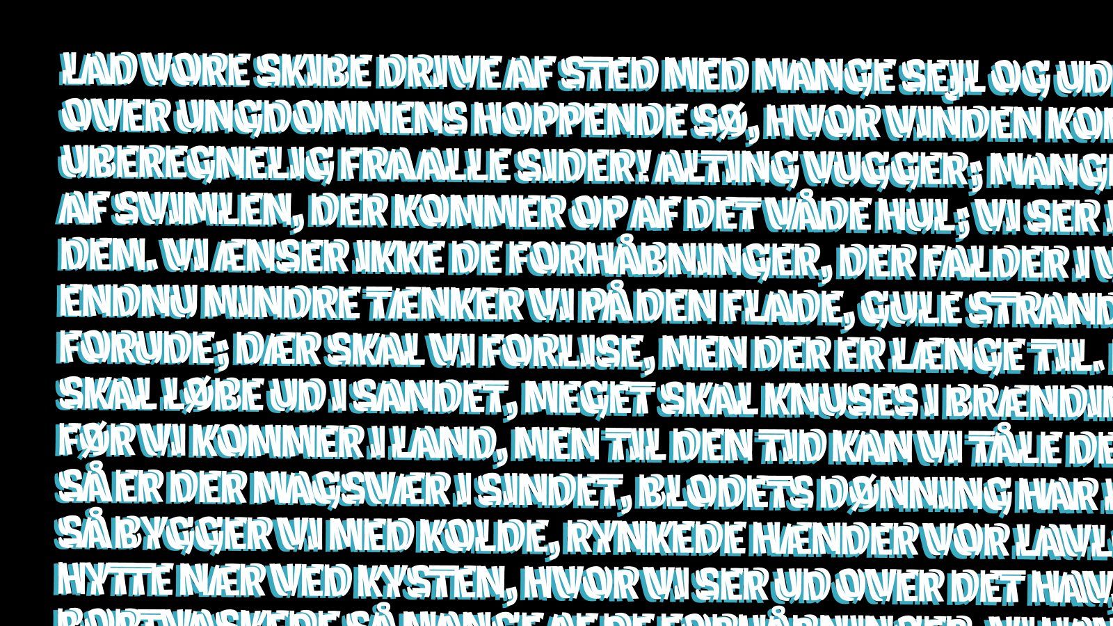
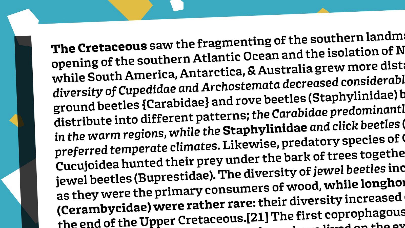
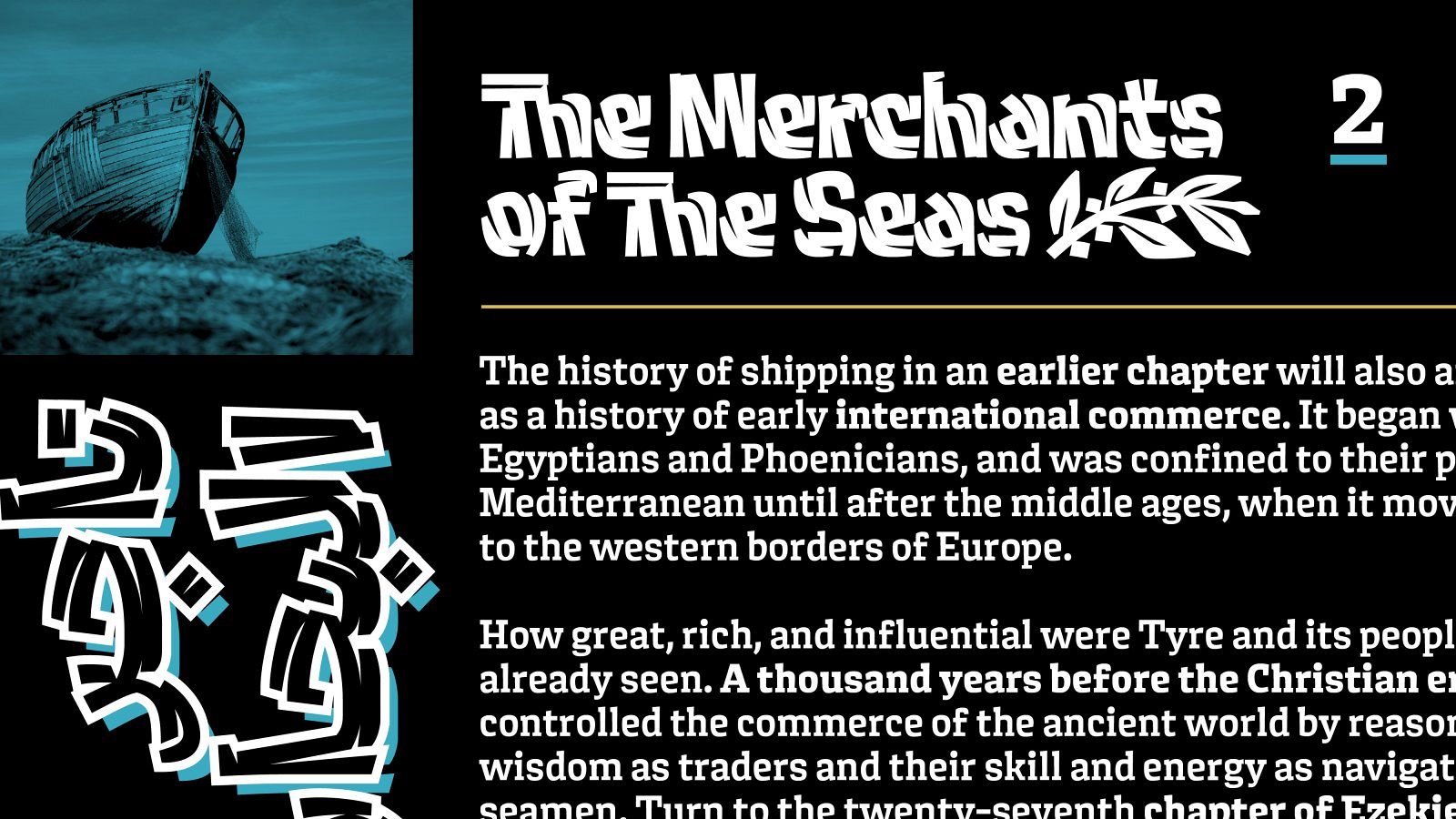
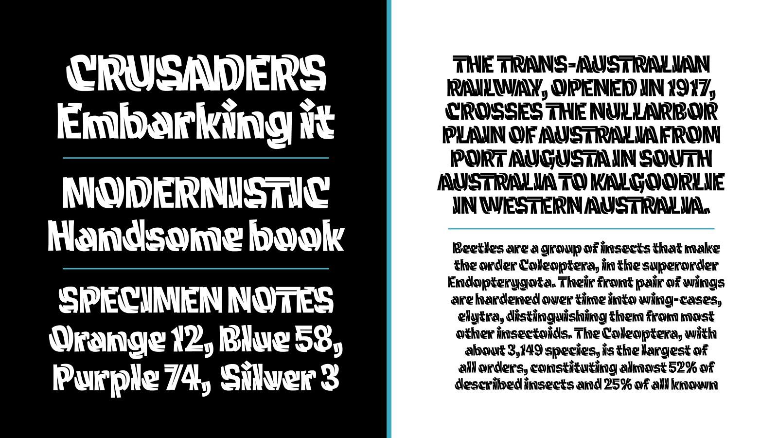
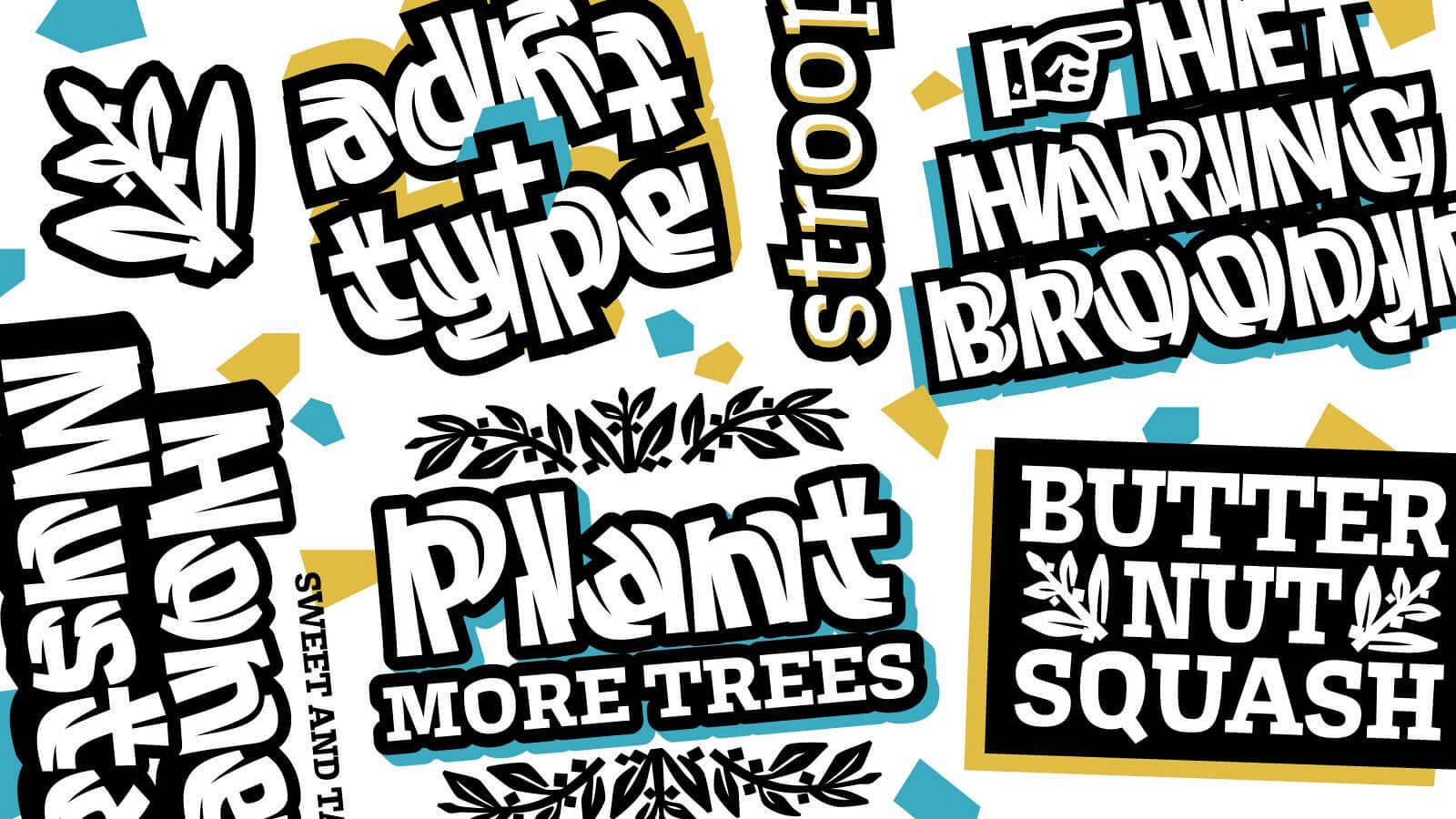
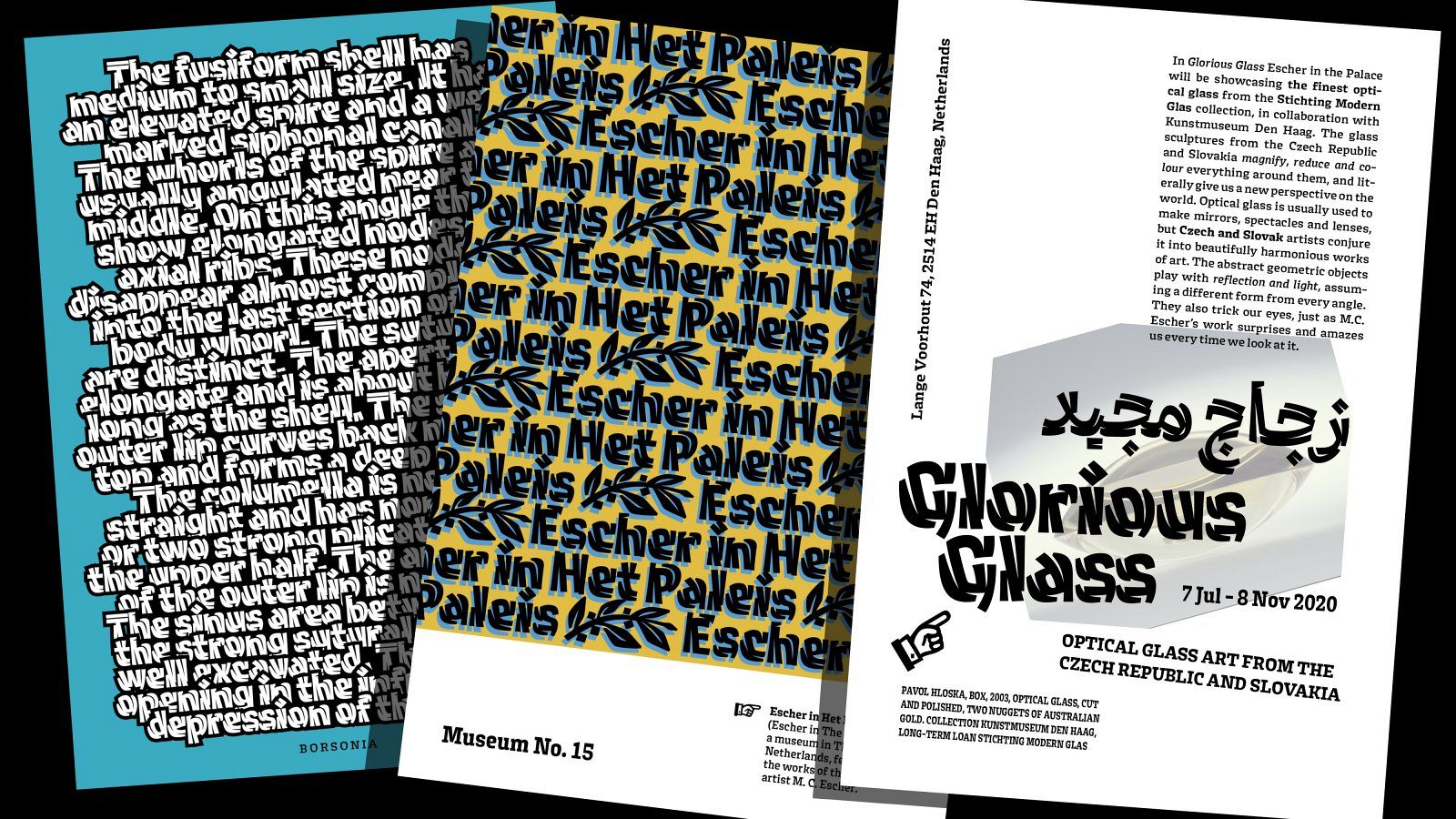
Cleft is a project that as a whole explores the differences of texture and the effects of typographic details in the overarching texture of text. It examines the interactions between form and spacing in a novel and new way, and investigates how these interactions can create new and different textures.
Cleft Twinline (A combination of the words twin and inline) focuses on the relationship between independent internal letters, and the external shapes that help to complete the letter forms. Deriving itself from inline forms, it challenges conventional models of inline construction.
Cleft Text explores emphasis within a line of text. It is designed with a top-down tapering effect within each letter. This taper creates a strong horizontal emphasis along the x and cap heights, and a weaker presence along the base of each character, making it so the text feels heavier on top without falling over.
