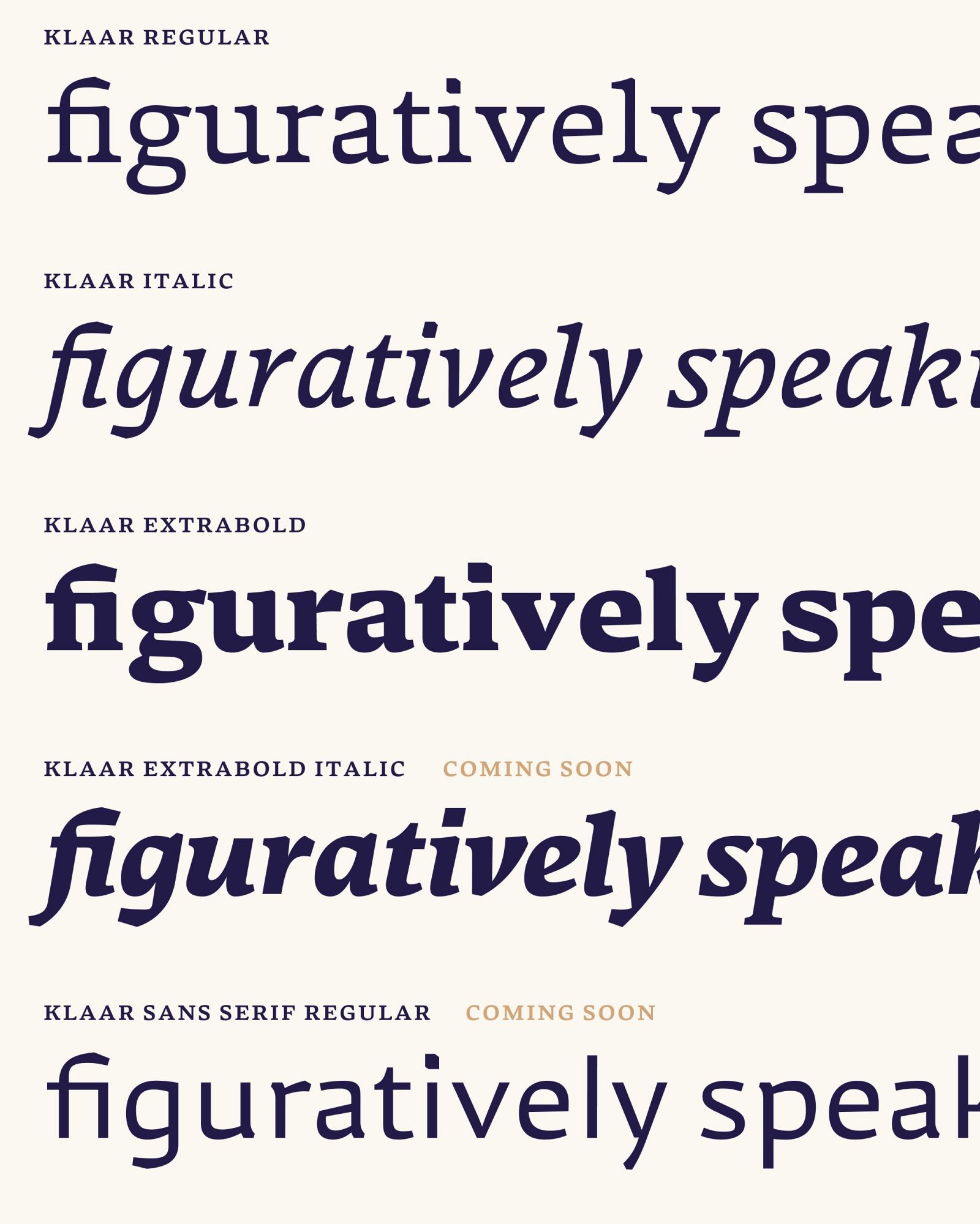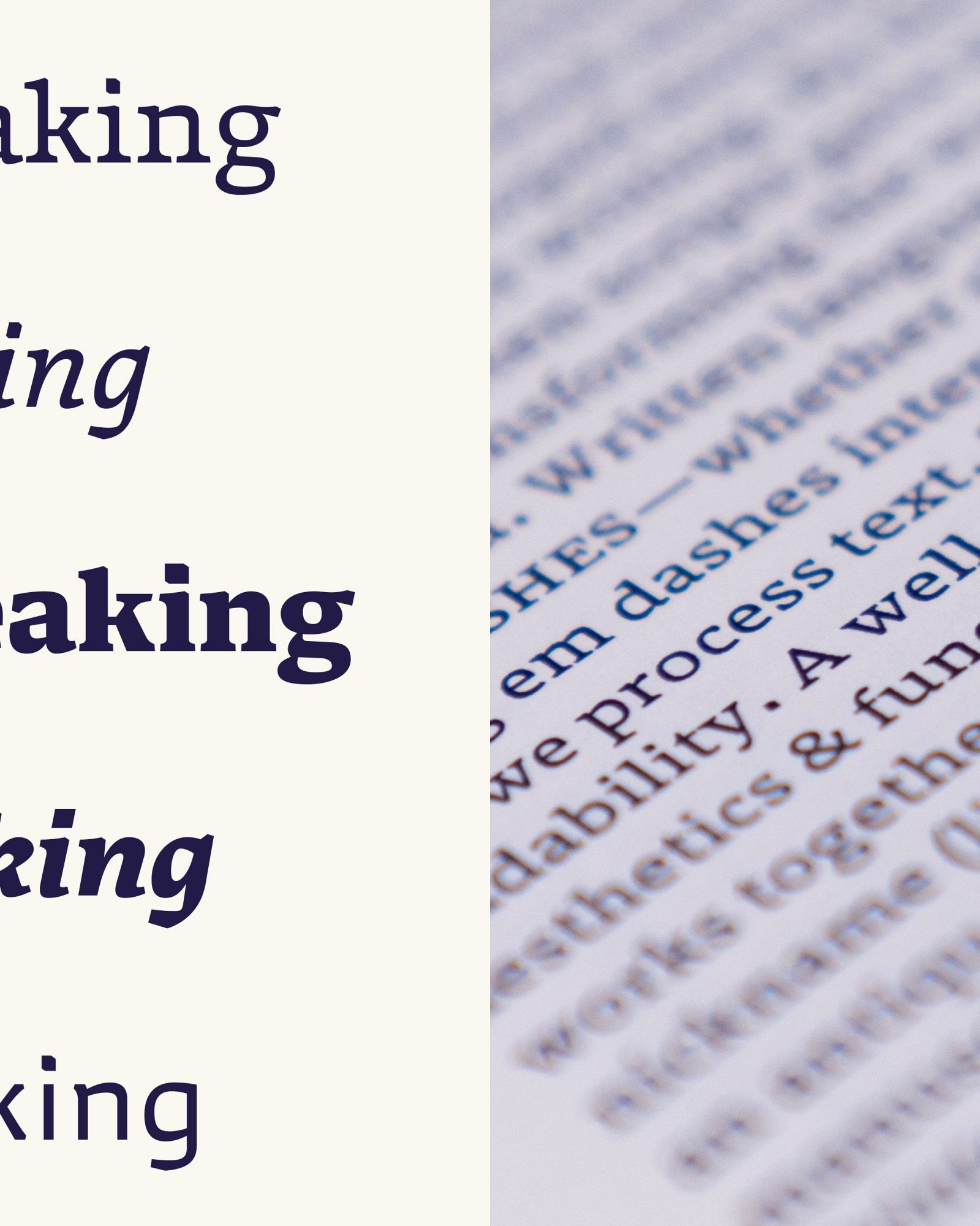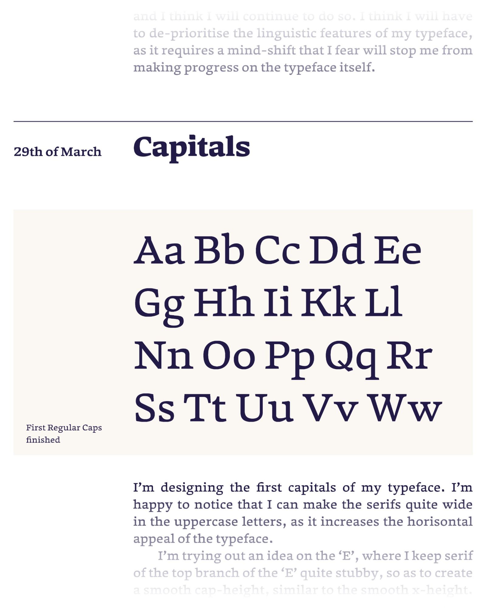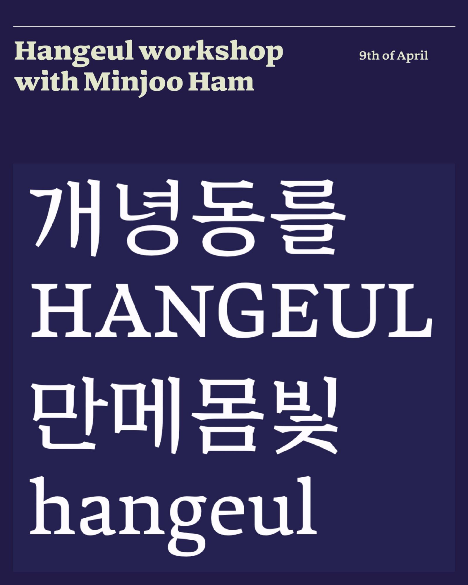
Down-scaling expectation for the final project became priority, and this resulted in my “font first — ask questions later” approach. By killing my darlings I was able to quickly start sketching on a design that could make me realise goals during the 2nd semester: Learning how to draw a conventional text typeface family. I set an abstract target of combining a rigid and organic appeal into one typeface. I also liked the idea of long serifs and a smooth x-height as I was drawn to the look and feel in my sources of inspiration. This resulted in wide and open counters and a natural wide spacing, which gave me the idea of working a typeface for extremely small sizes.
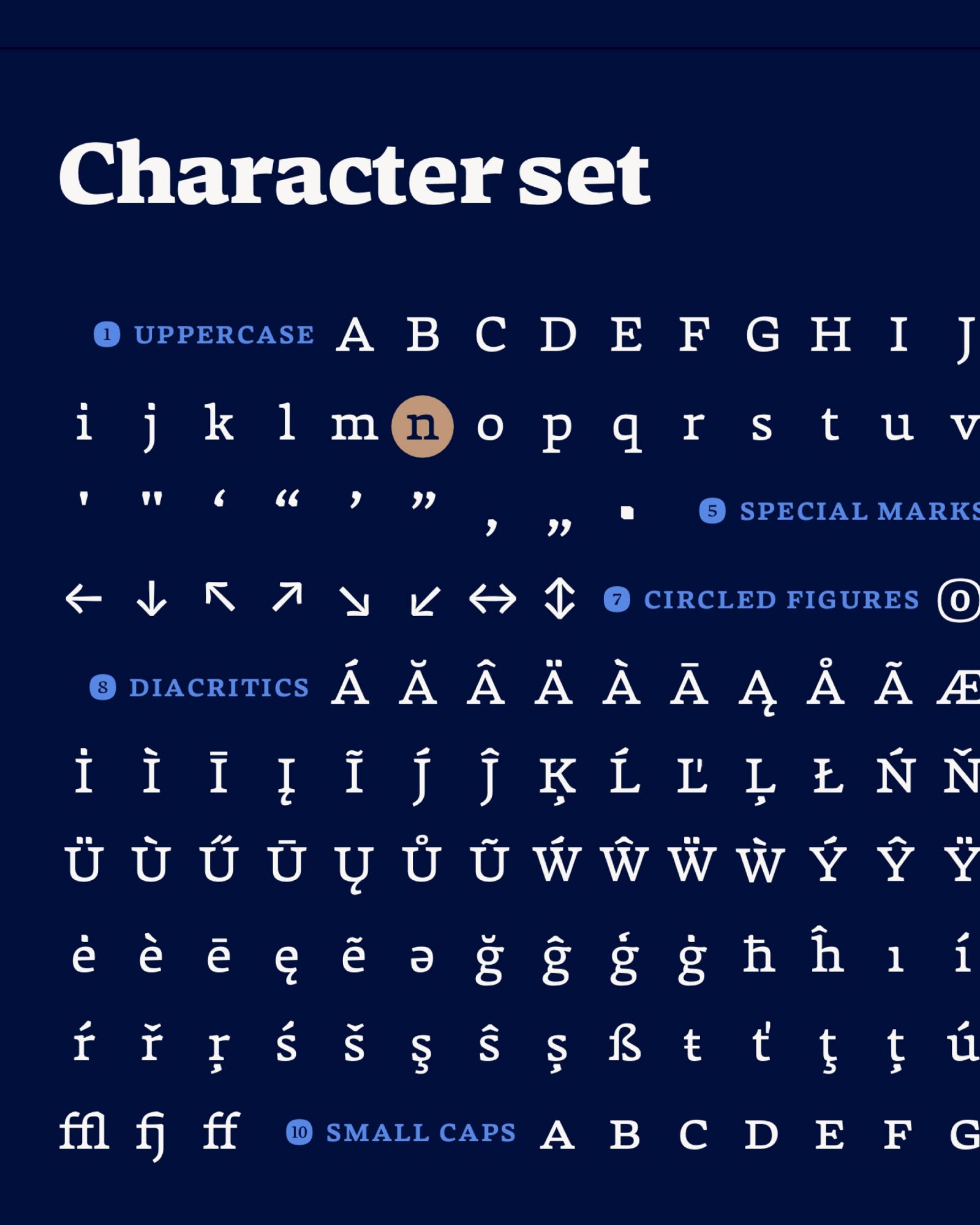
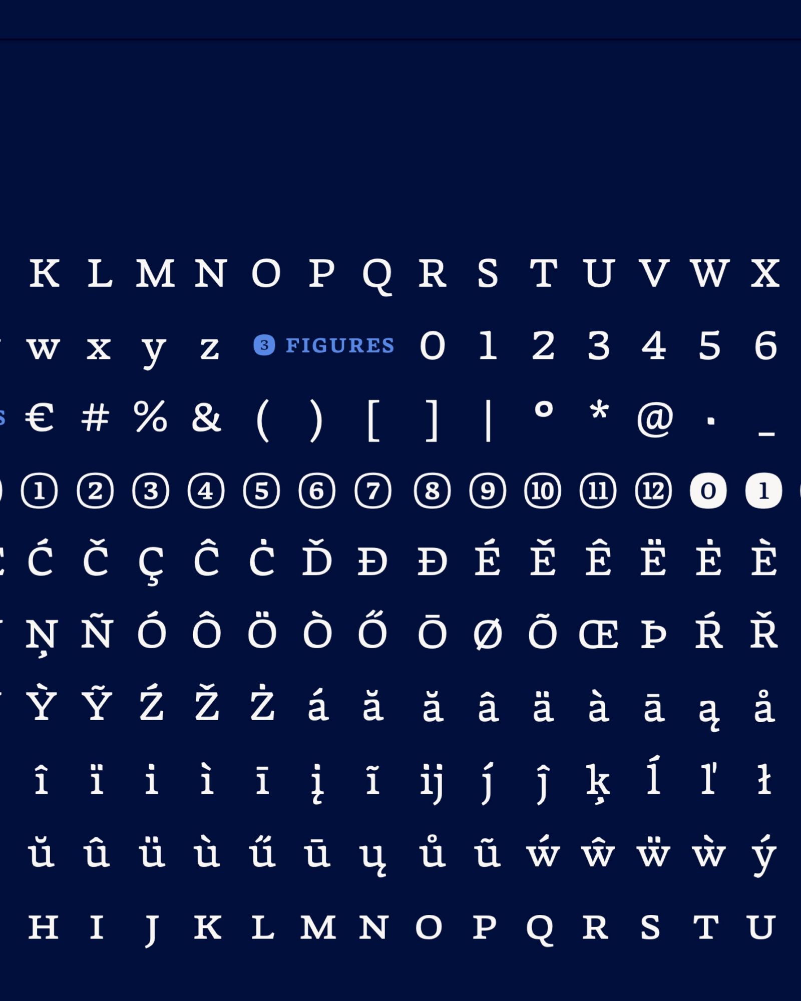
The name of my typeface is Klaar. It is a Dutch word that can be intended as “clear” or “ready”, both of which my typeface family had to be by the end of the semester. The intended usecase is for any kind of instructions, which is why I felt the name was fitting. The circled figures, arrows and the good legibility in all sizes support this context.
