Celine Jouandet
Keywords: Type design, Typography
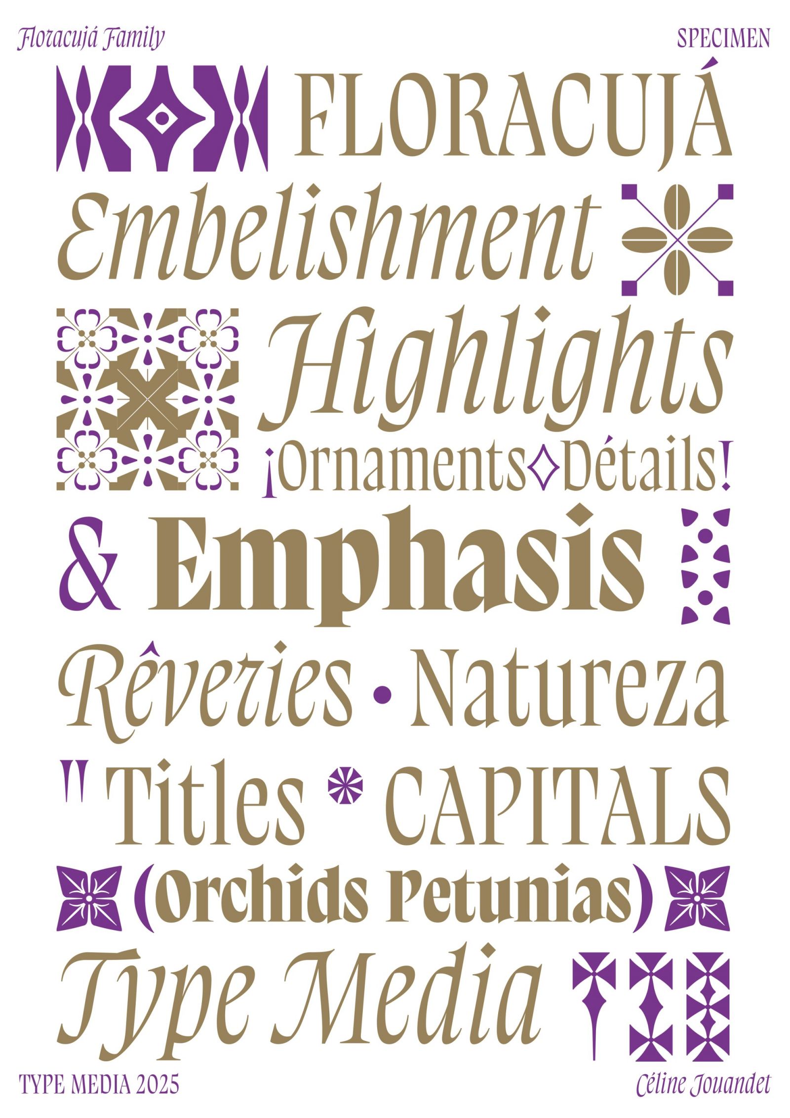
Floracuja is a type family inspired by Brazilian Baroque. It’s a style that’s very dear to my family and has shaped my visual environment since I was young.
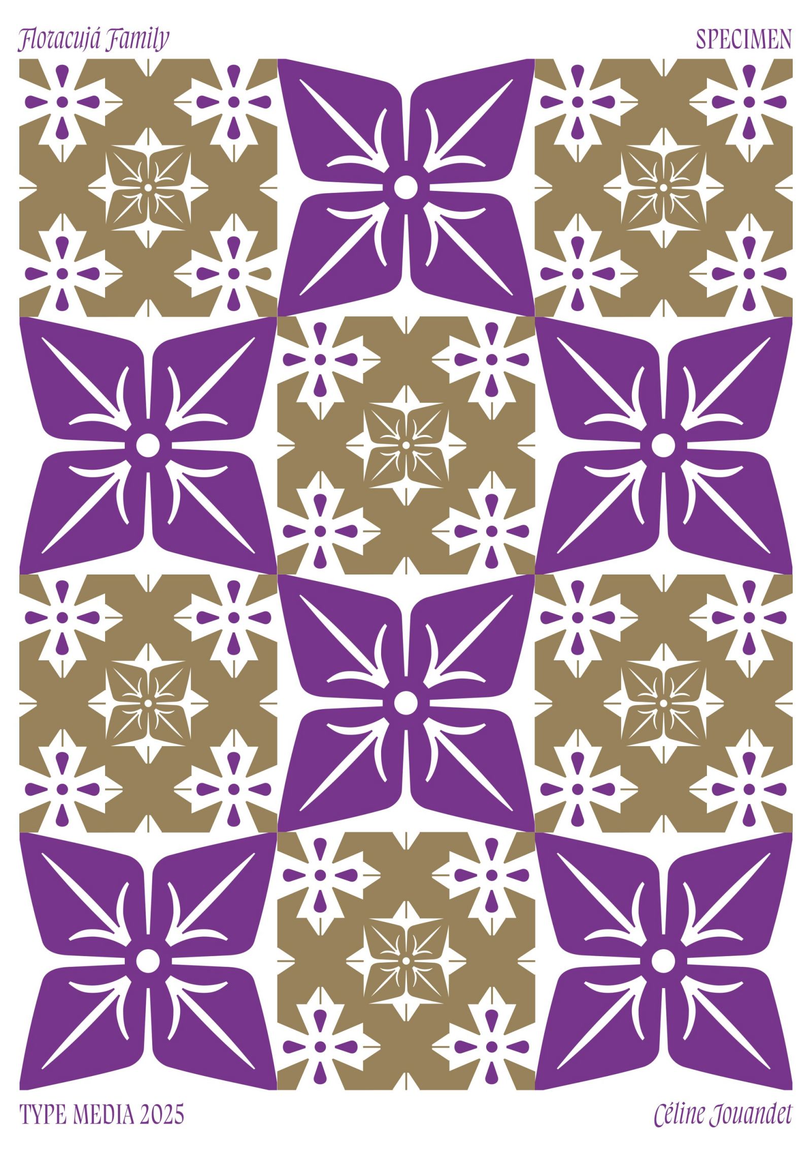
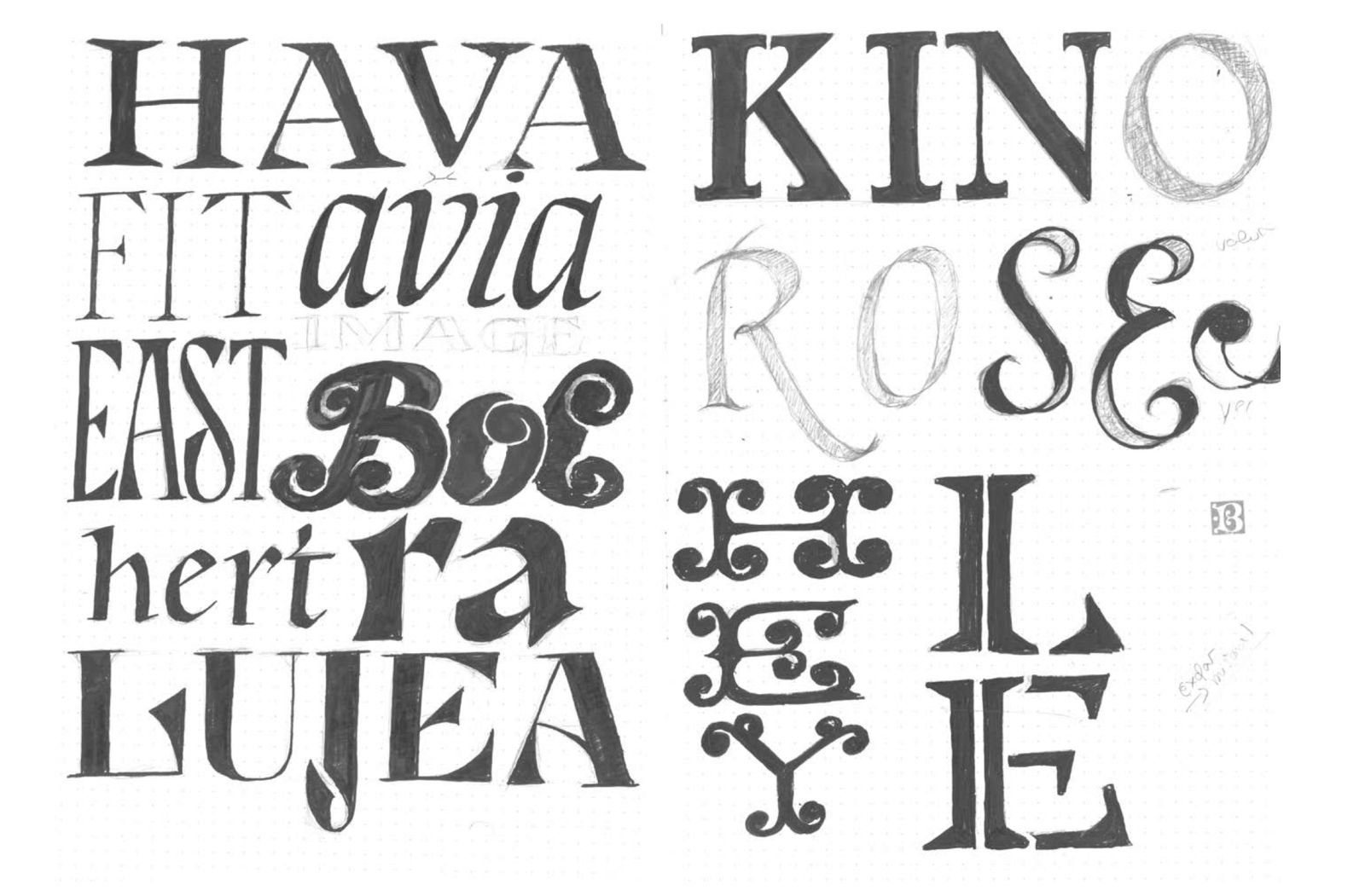
I chose to reinterpret this style by connecting the wooden carvings typical of this aesthetic with wood letters and letterpress. This led me to explore a monospaced typographic system, combining capitals and ornament.
I use ornament in a modular way, to create patterns and decorative compositions. Still in line with my interpretation of Brazilian Baroque and the cultural mix that defines Brazilian identity, I explored a hybrid contrast, mixing translation in the letterforms and expansion in the terminals.
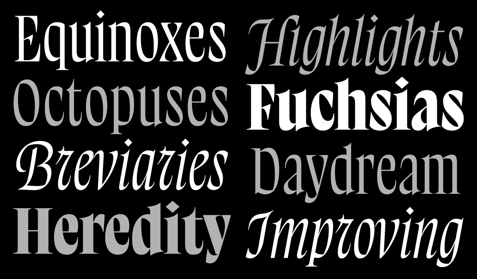
Floracuja was designed for book covers, by exploring different ways to create emphasis:
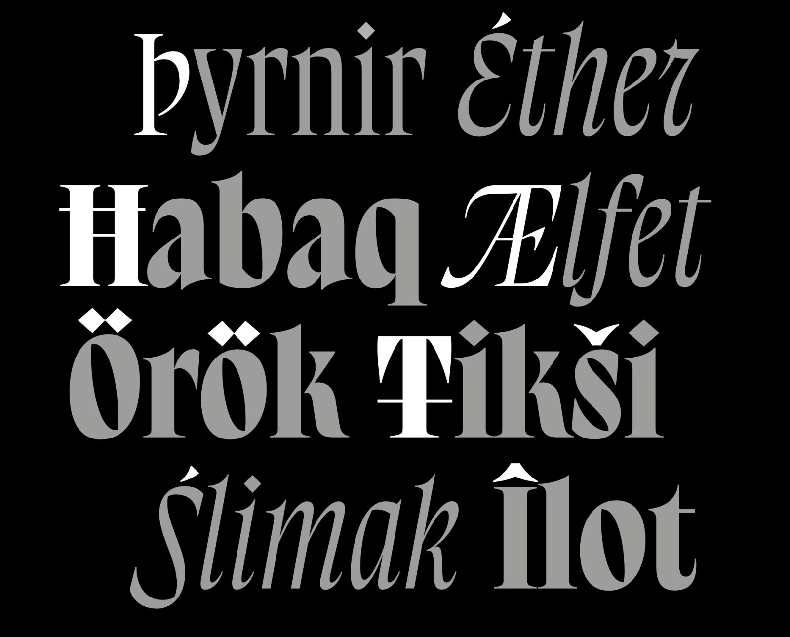
– through the capitals, which I made as expressive as possible, since this width is commonly used for titling;
– through weight, with an interpolation from Regular to Black;
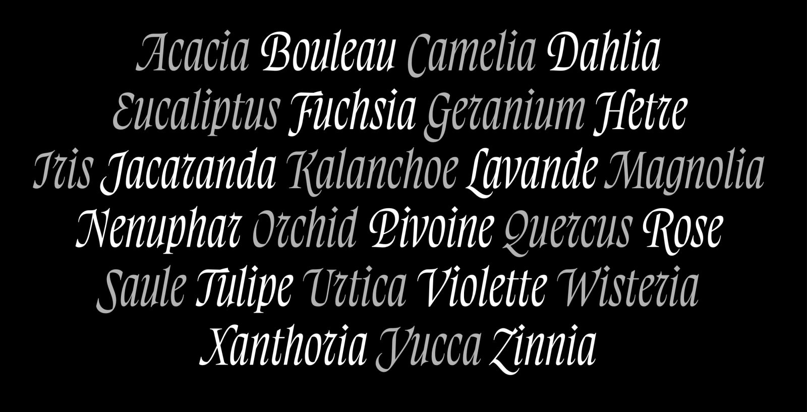
– and through italic, which includes ornamented capitals to further enhance the decorative feel.
Ornaments, of course, also contribute to embellishment and emphasis.
