Esther van Bronkhorst
Keywords: Queer, Patriarchy, Lgbt
Internship: Coline en Ré
Read Thesis
www.instagram.com/esther__bronkhorst/
esthervbronkhorst@gmail.com
+33781332072
There isn’t one way to be queer, and there is more than what we see on social media. For centuries LBGT people have been lost in the crowd, living by travesty or repressing their feelings. My installation oscillates between LGBT and Queer, between the labels we give. Queer is a political statement, but queer is also spread everywhere without notice. Maybe queer doesn’t need notice, doesn’t need a coming-out.
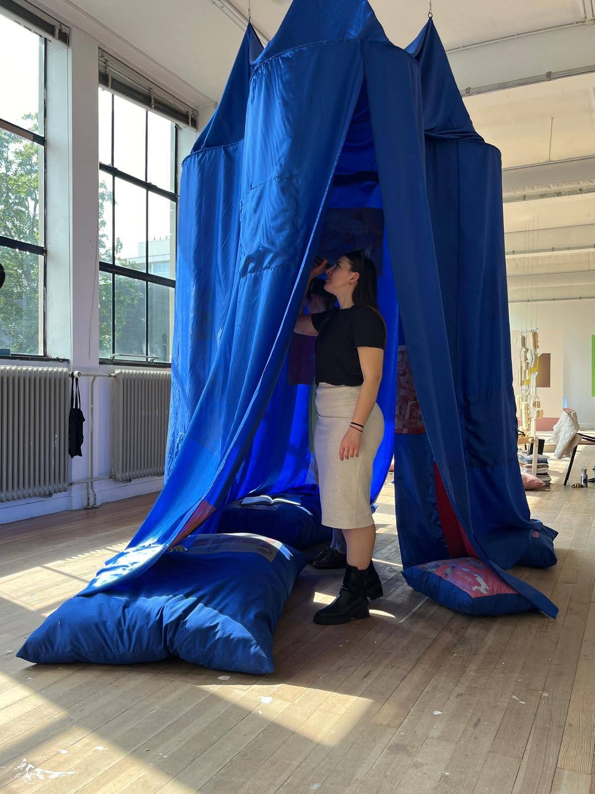
‘Shades of the in-between’ is about the magic of the discreet queer. This peaceful space tells a story about accepting the marginalized, but also about materializing the imaginary and the catchiness of graphic design.
I am Esther van Bronkhorst, a graphic artist, researcher and designer. I often work on the themes of language, identity or poetry.
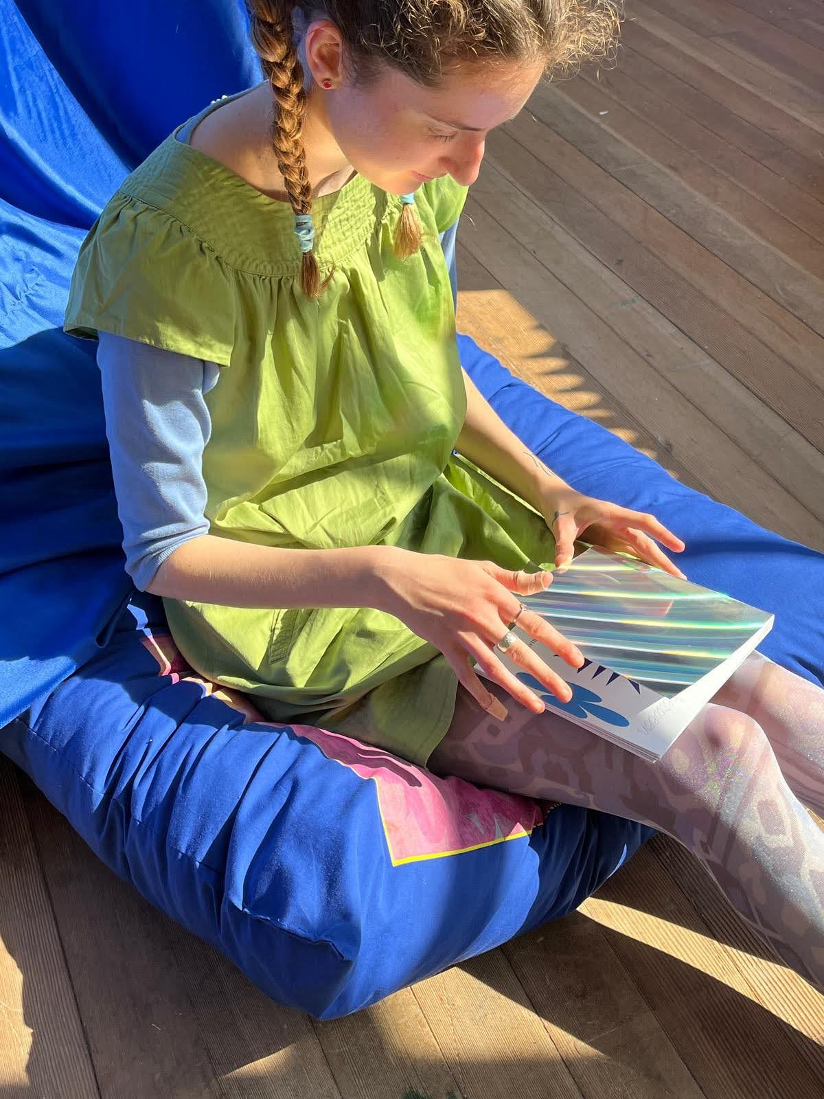
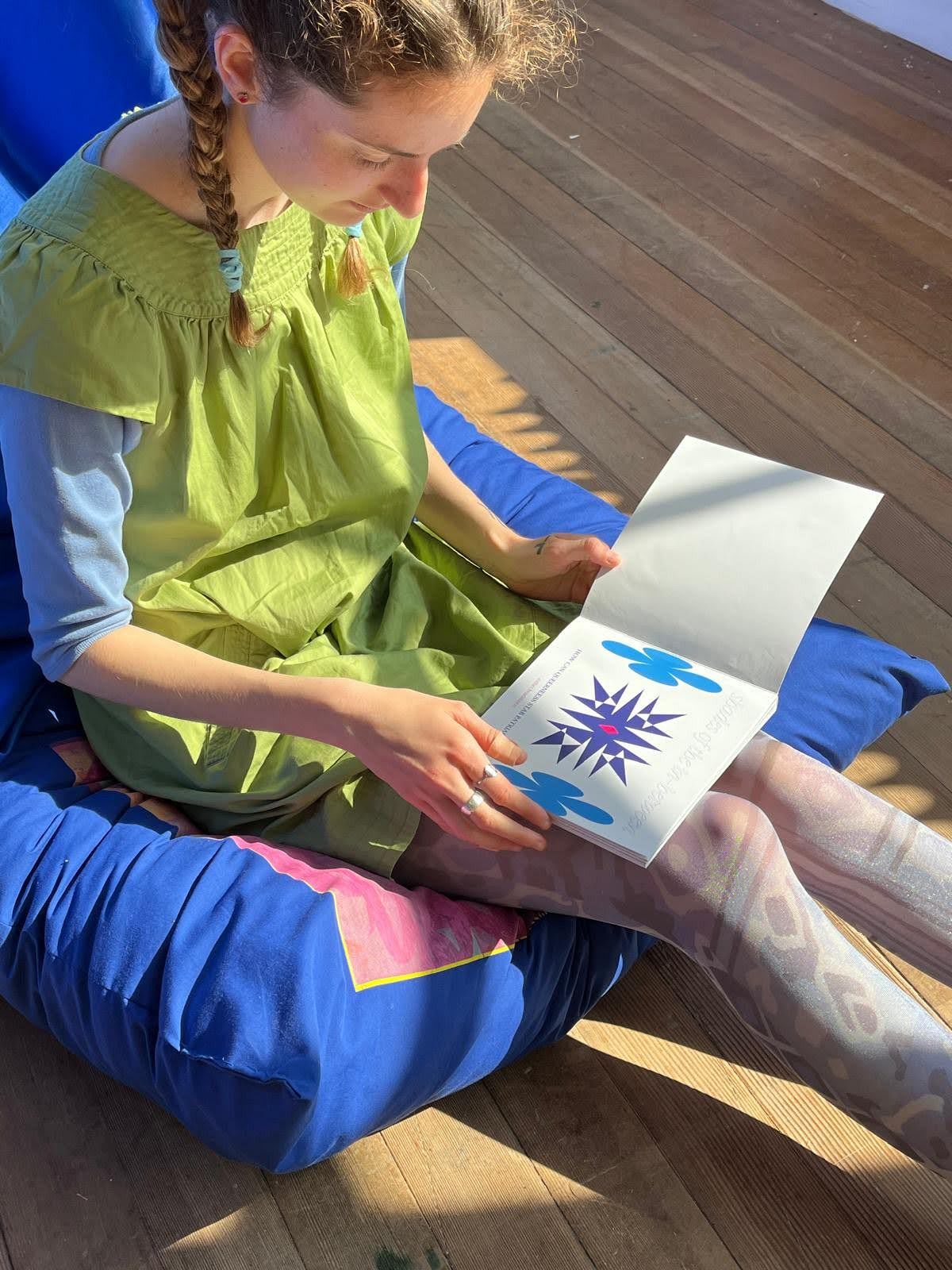
My thesis is a theoretical text in which I explore the relation between queer and patriarchy. My research question was « how can queerness stab patriarchy? »
It contains 3 illustrated chapters, including interviews on our "ideal queer world".
I brought a particular attention to the fonts, the layout and the printing.
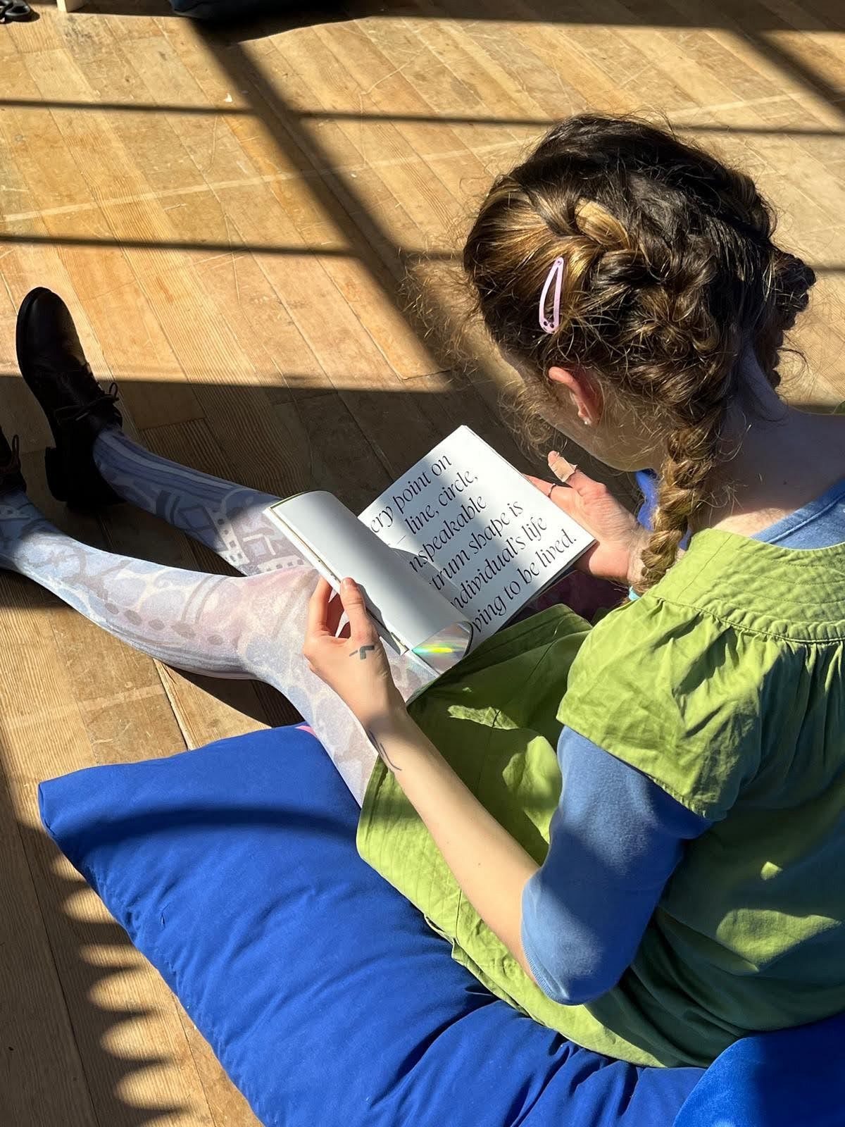
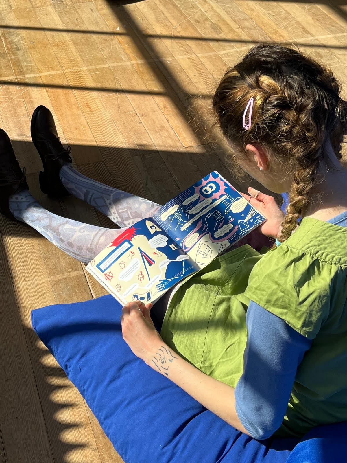
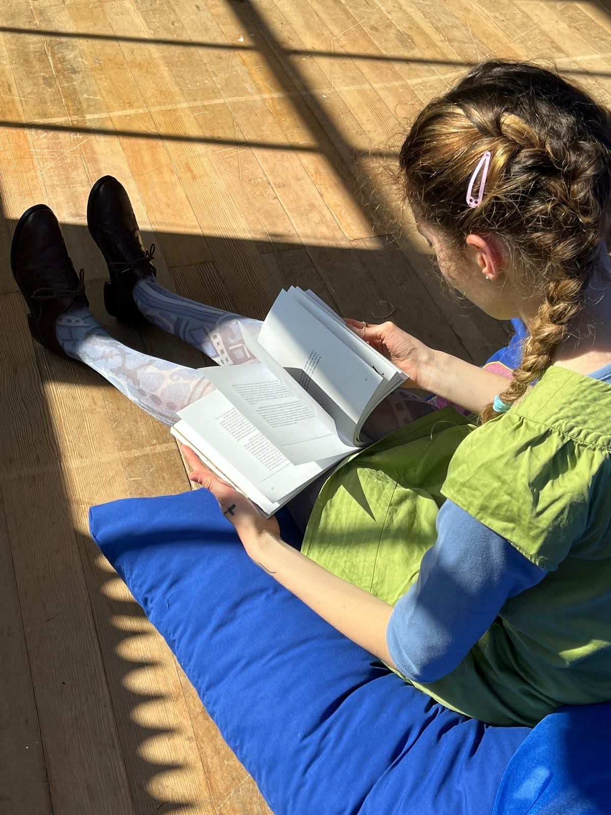
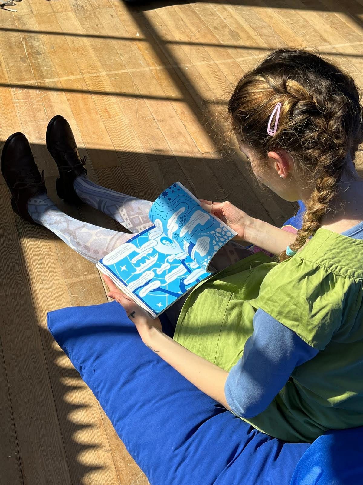
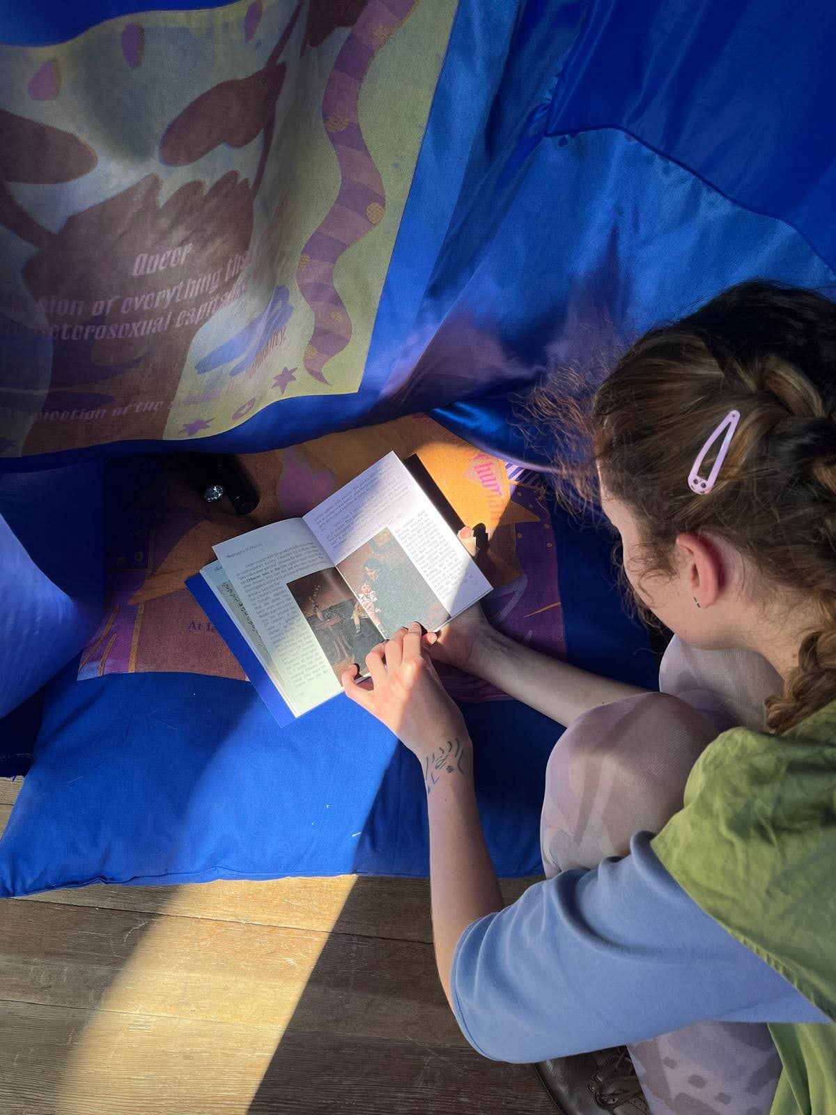
I explored one element of the topic of « queerness » in the character of the Joker, as one of the 1st non-binary representations in iconography through card games. Card games have always had two jokers, a red and a black, but these cards are often put aside and don’t participate in the game. There are no fixed rules about the physical representation of jokers, whereas the Kings, Queens and Jacks are very regulated. They have always been there but often forgotten, and in this way I consider jokers as archetypes of queerness. They are few but powerful, way more powerful than the 12 court cards. I wrote, designed and created a book about jesters, tricksters, and whatever other name they are given.
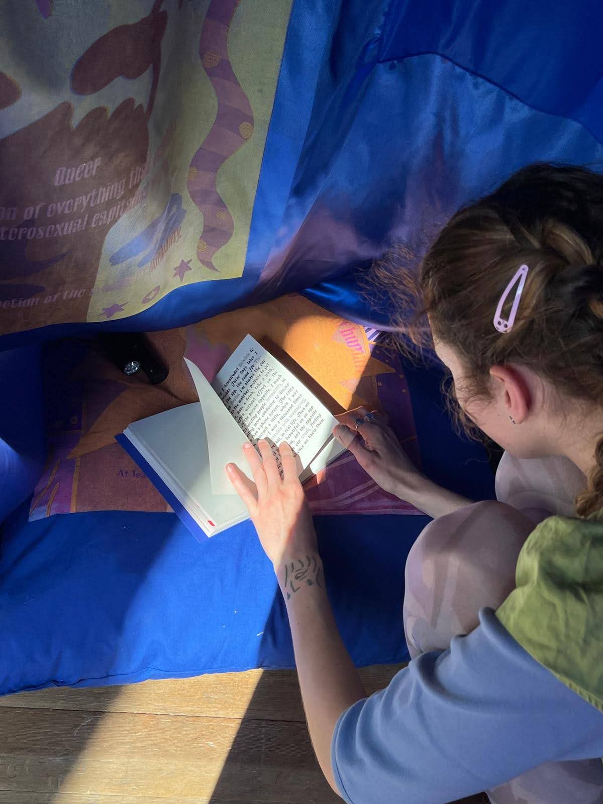
This research helped me to create a representation of my thesis: a tent inspired by the joker. The blue is a magical and dreamy color, the form derived from the circus. On the surface extracts of the book are written with invisible ink. In addition, silkscreened illustrations from my thesis and meaningful sentences are printed on the inside.
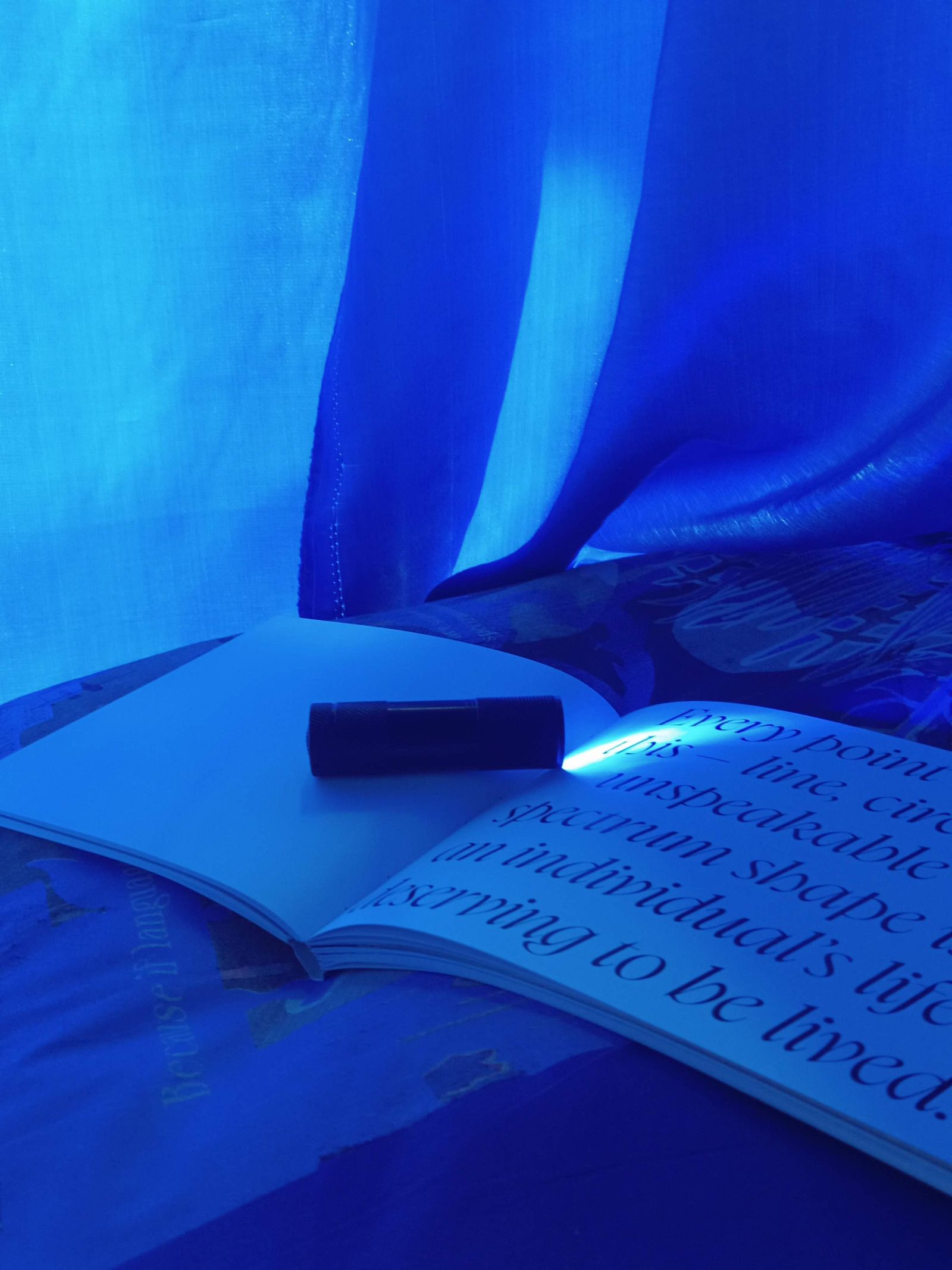
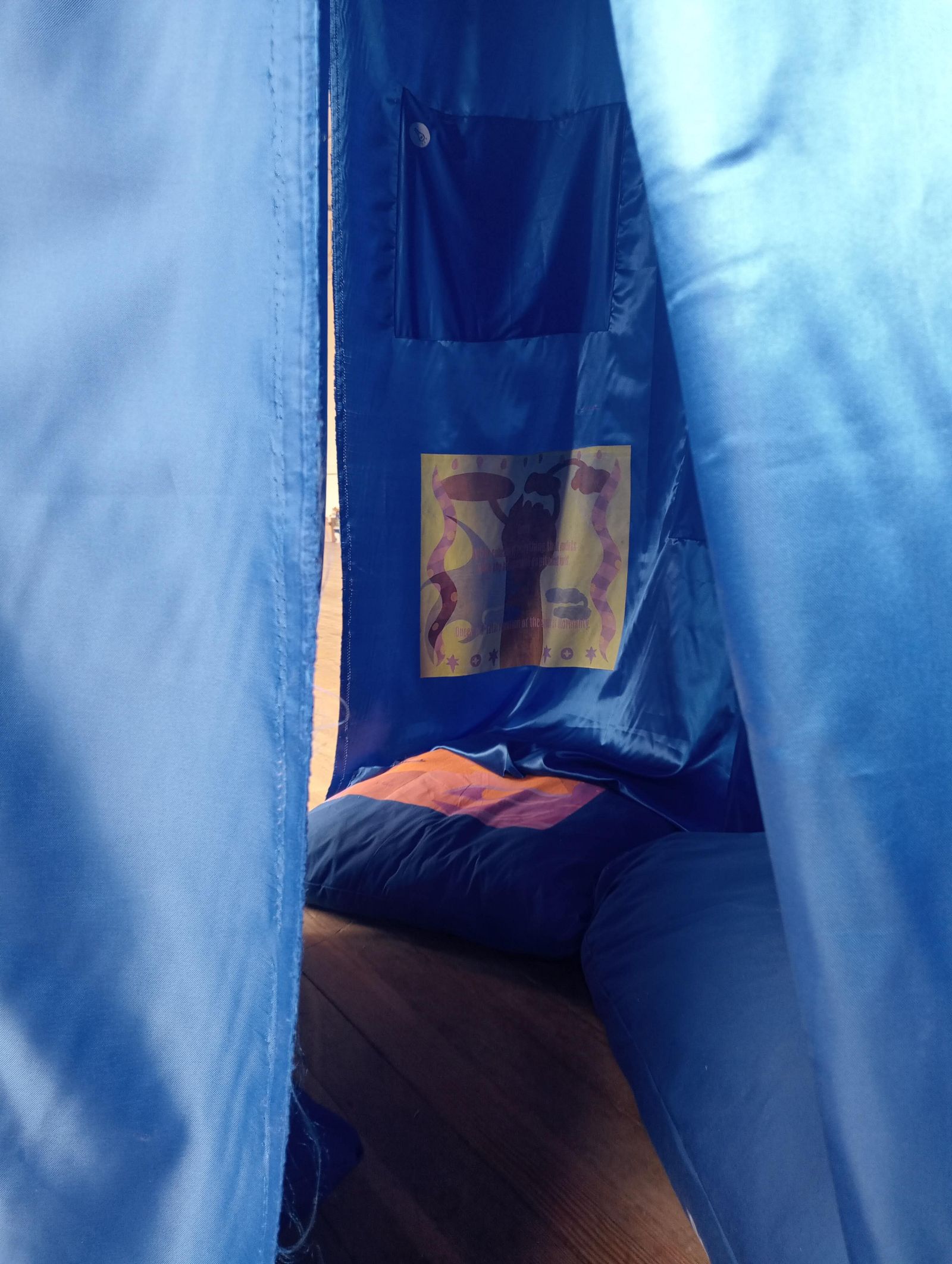
With the project « shades of the in-between », I do not intend to convince the public of my arguments, but more to raise awareness about queerness. It is a space for dialogue, for reflection, for opening our minds. UV lights are present on the pillows: they invite the public to an interaction: making the decision, by themselves, to highlight a queer narrative that is hidden. And among those texts, you will find answers to « how can queerness stab patriarchy? ».
I propose an experience to the visitors through layers. The research, the thesis, the joker narrative, the tent, the invisible, the drawings. Many elements, carefully selected come together to physically represent my fascination for graphic design. My practice is about languages: visual, verbal and written language, languages of the unknown and the unspoken. I based myself on the current and evolving context we’re living in to tell a narration and share a part of my imaginary.
