Mika Schalks
Keywords: Queer, Television, Animation
Internship: Holy Motion Studio
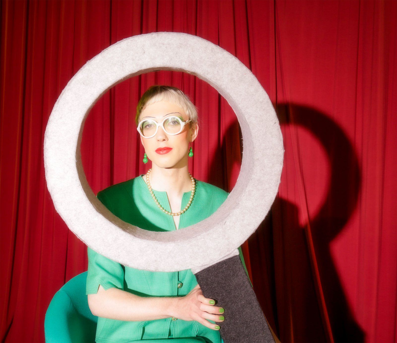
My name is Mika Schalks. I am a "graphic designer" as well as a self-proclaimed gaiety-enthusiast, encouraging the omission of narrative and performativity. In my work, focused largely on the light-hearted nature of aesthetic, I induce a feeling of vague tangibility to a narrative seemingly reduced to nonsense. It is why gimmick and exaggeration hold such a firm place in my heart, as they so closely express what inspires and animates us, and do so in a gloriously unapologetic manner. I, too, aspire to be so gloriously unapologetic. I also aspire to be so celebratory of the playfulness that attracts us to design to begin with. I work with bright colours and with an ever-open possibility for change and revision, fully embracing the reign of chance and in full approval of Murphy’s ill-famed law. My work appears to start with a special appreciation for analogue processes precisely because of their characteristic tendency towards playfulness and performativity.
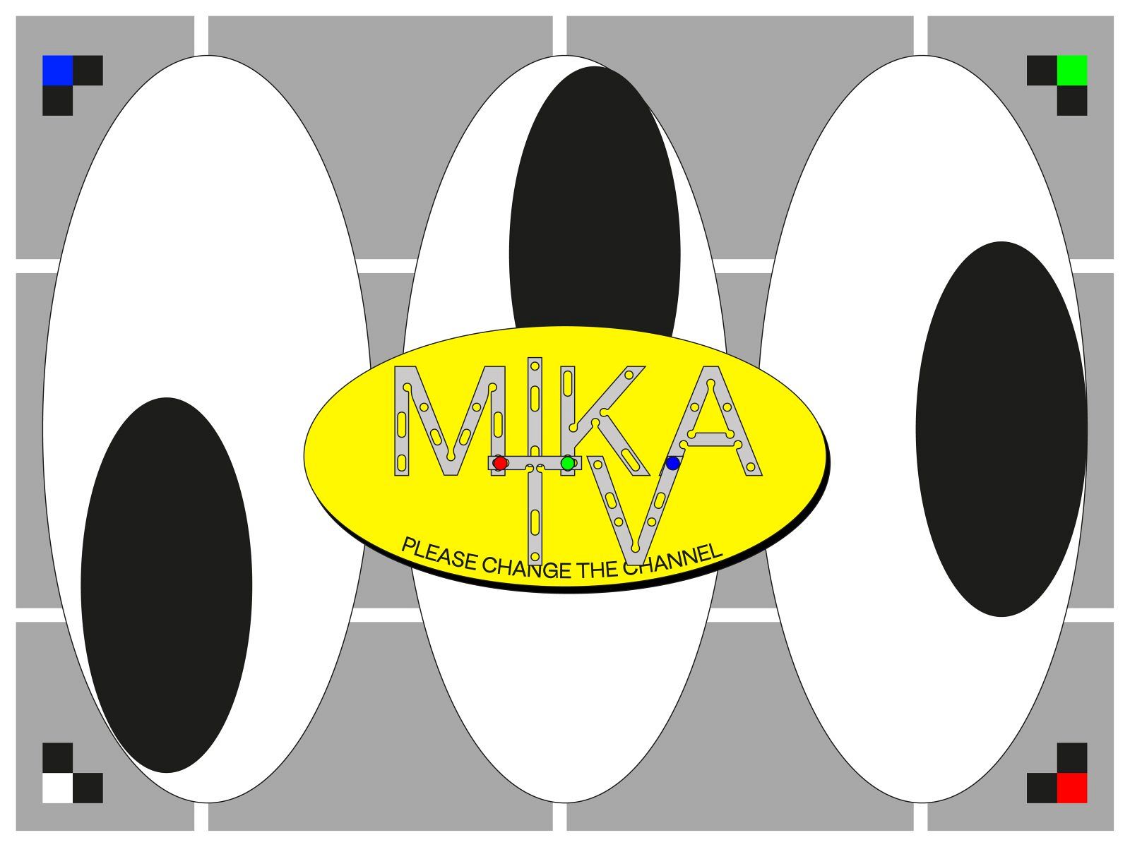
MIKA TV
Graduation Project
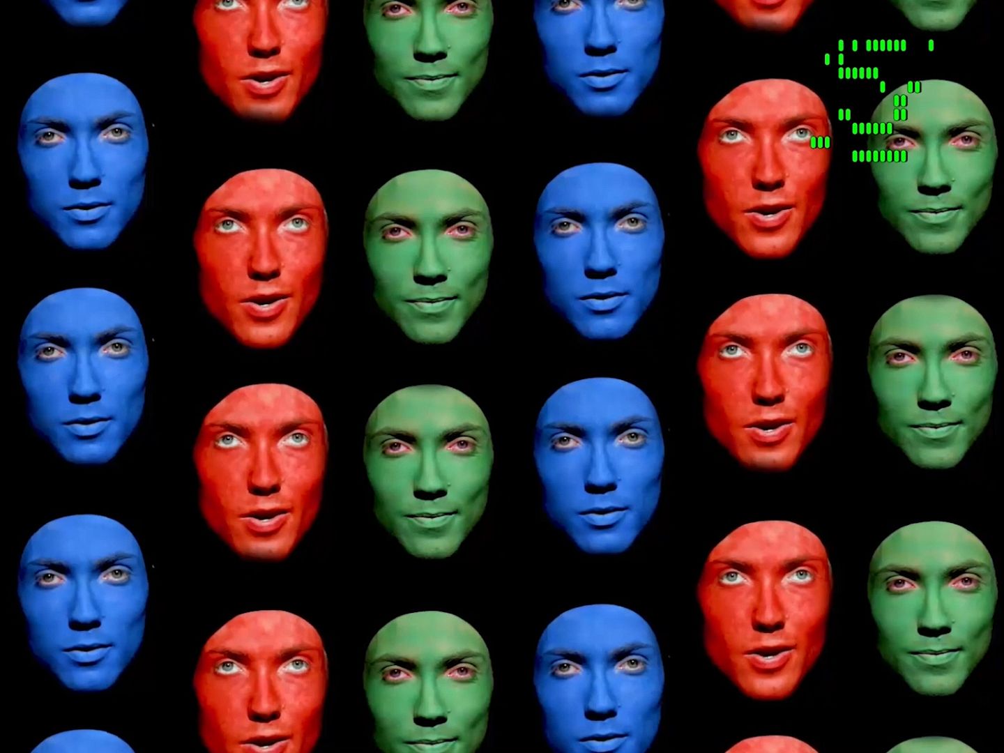
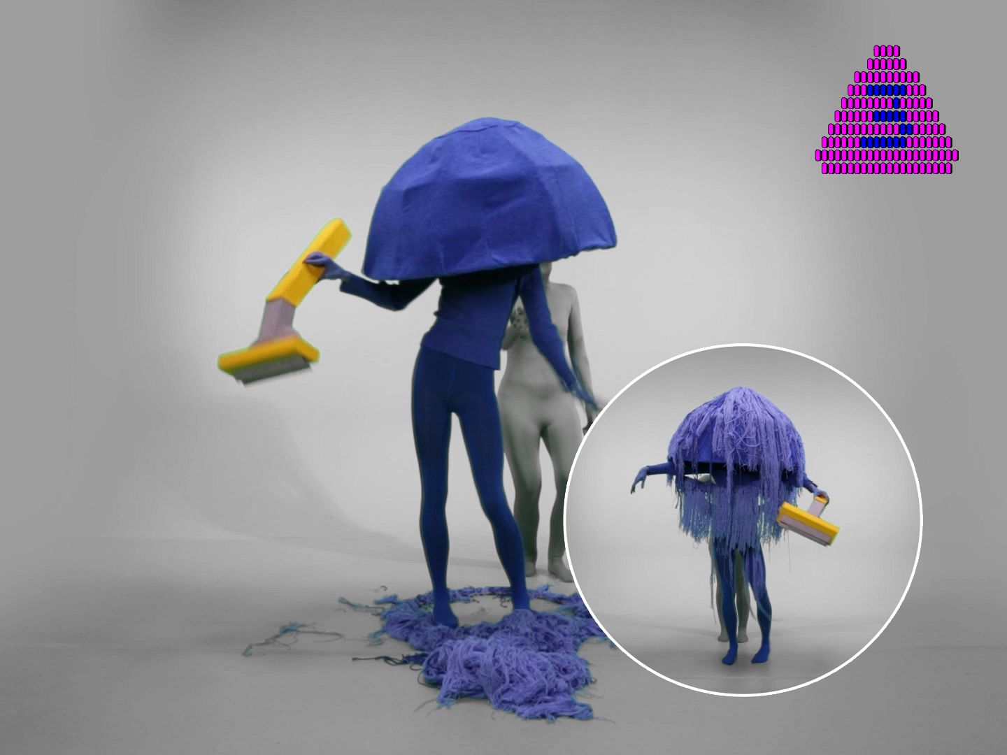
The medium of television is no more. A world that once was rainbow-coloured is now abandoned and covered in black-and-white transmission noise. It is ruled by the Watcher, an all-seeing creature with a million eyes, ever spreading a million lies. But when we, square-eyed viewers, take a closer look at our screens, red, green and blue monsters are looking right back at us. Are they trying to tell us something? Can red, green and blue make the abandoned land of television multicoloured again? Perhaps the next channel has a better signal.
Mika Schalks embraces the medium of television and its queer potential in a series of TV channels. Tune in to Mika TV and start zapping.


ON RED PURSES, YELLOW SOCKS & BOLD BEEHIVE UPDO'S
Thesis
With this thesis I attempt to explore Camp aesthetics through children's television. Camp aesthetics, the highly stylised, exaggerated, “unnatural” or “so bad that it’s good”, is often considered bad taste or meaningless, but it is this that attracts us to it. As the Camp sensibility is also connected to elegance, androgyny and the history of queer style, I believe it is this certain queerness that can be a powerful tool for understanding complex philosophies. To understand where Camp comes from it is important to understand the performativity of gender roles and the stereotypes that enforce binary thinking. The Camp sensibility might not always be queer, but to use the aesthetics of Camp means that there is an understanding of the world in style, an understanding outside of the binary box. Perhaps for a split second you might even forget the existence of any kind of box in the first place. It is not a matter of style, it is the matter of style. I aim to make the “vision of the world in style” understandable by looking at children’s television that introduces a non-binary thinking to children. I am aware of the limitations that come with writing from my own perspective, considering my education in graphic design rather than gender studies or film history. Nonetheless I believe it to be of interest to all cultural fields to welcome an attitude in favor of Camp.