Nina Botthof is an Austrian designer. After learning fashion design and dressmaking she studied Information Design and Communication Design at the University of Applied Sciences FH Joanneum in Graz. She also completed internships and semesters abroad in London, Berlin and Frankfurt. Her work focusses on emotional, but functional expression. Coming from a background in fashion, she likes to experiment with materials and also introduces this into her graphic design work.
GRADUATION PROJECT
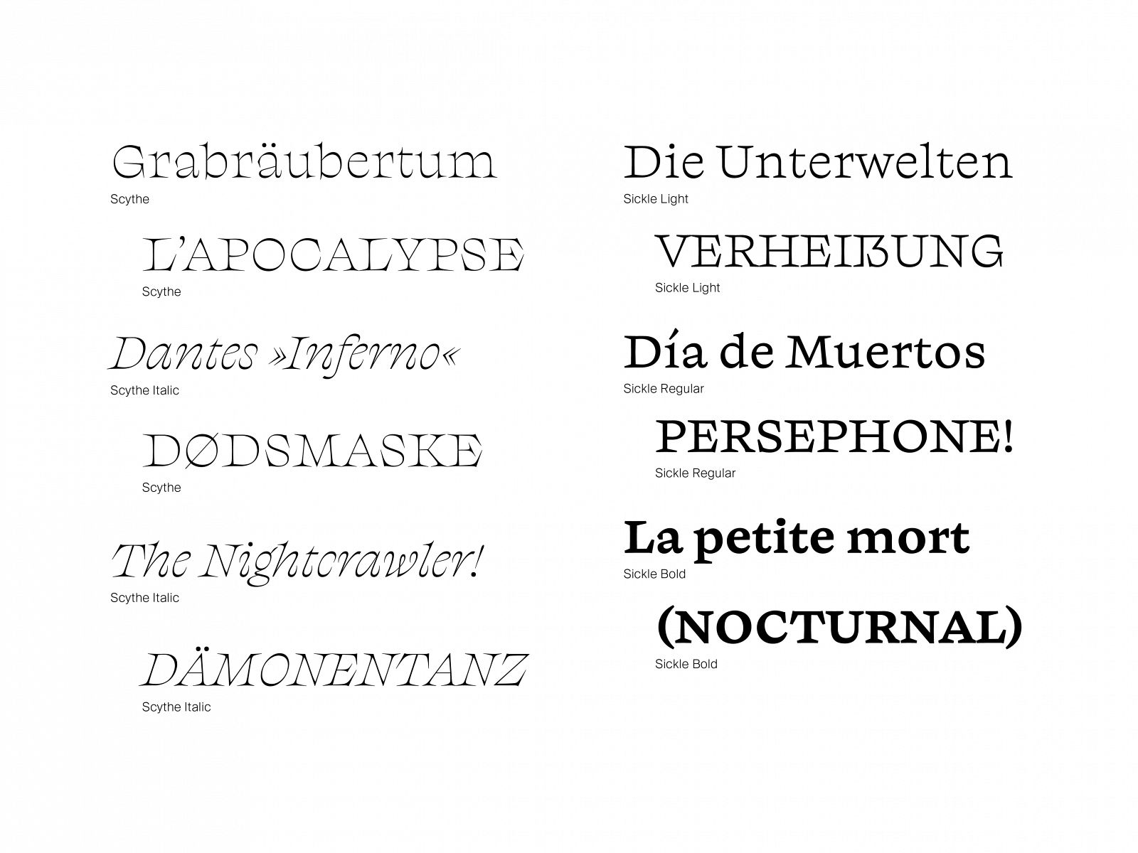
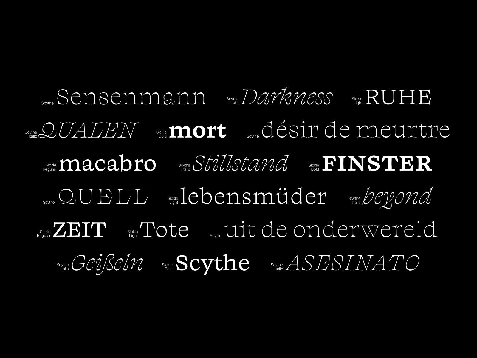
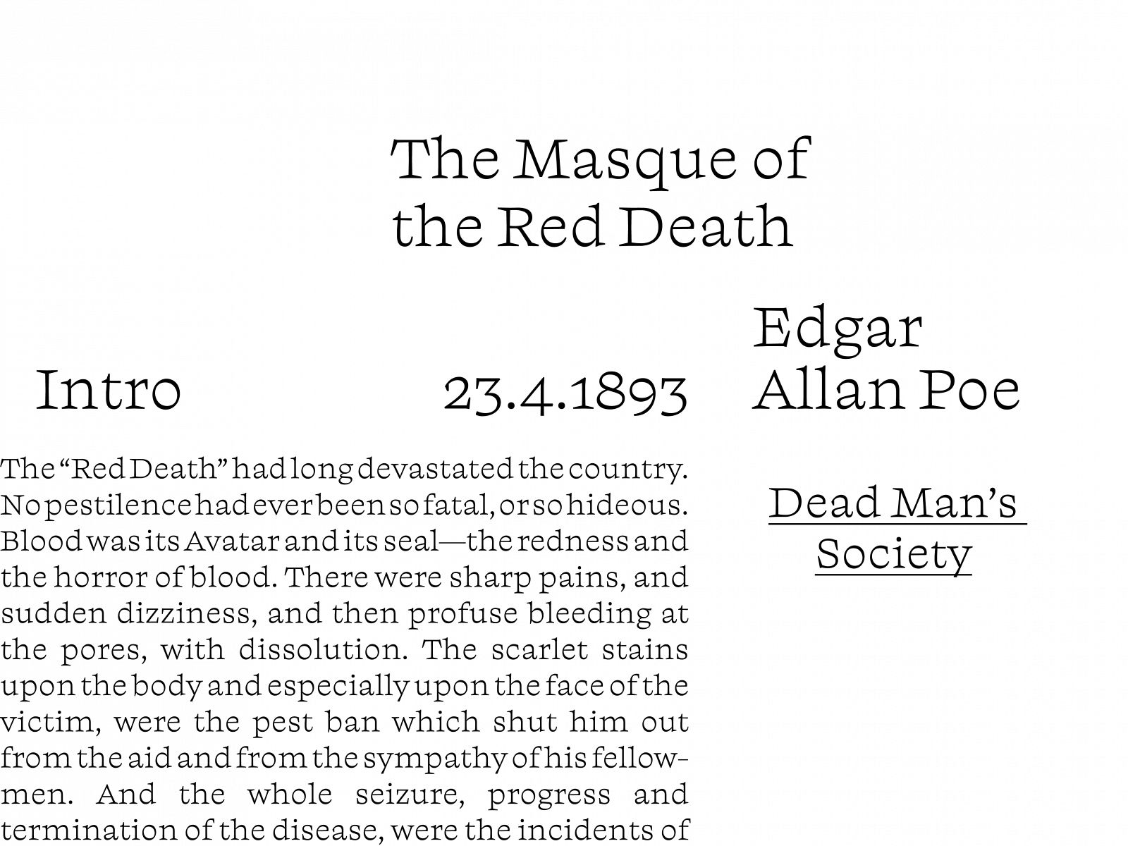
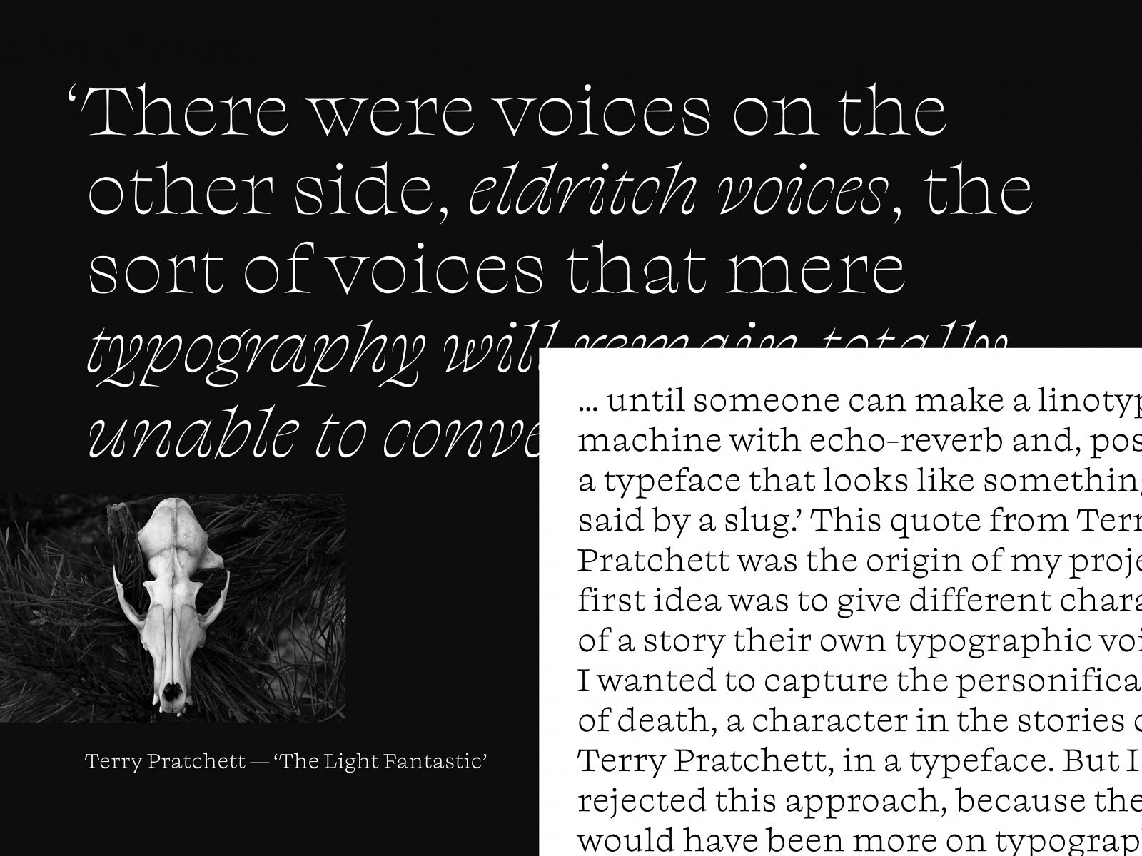
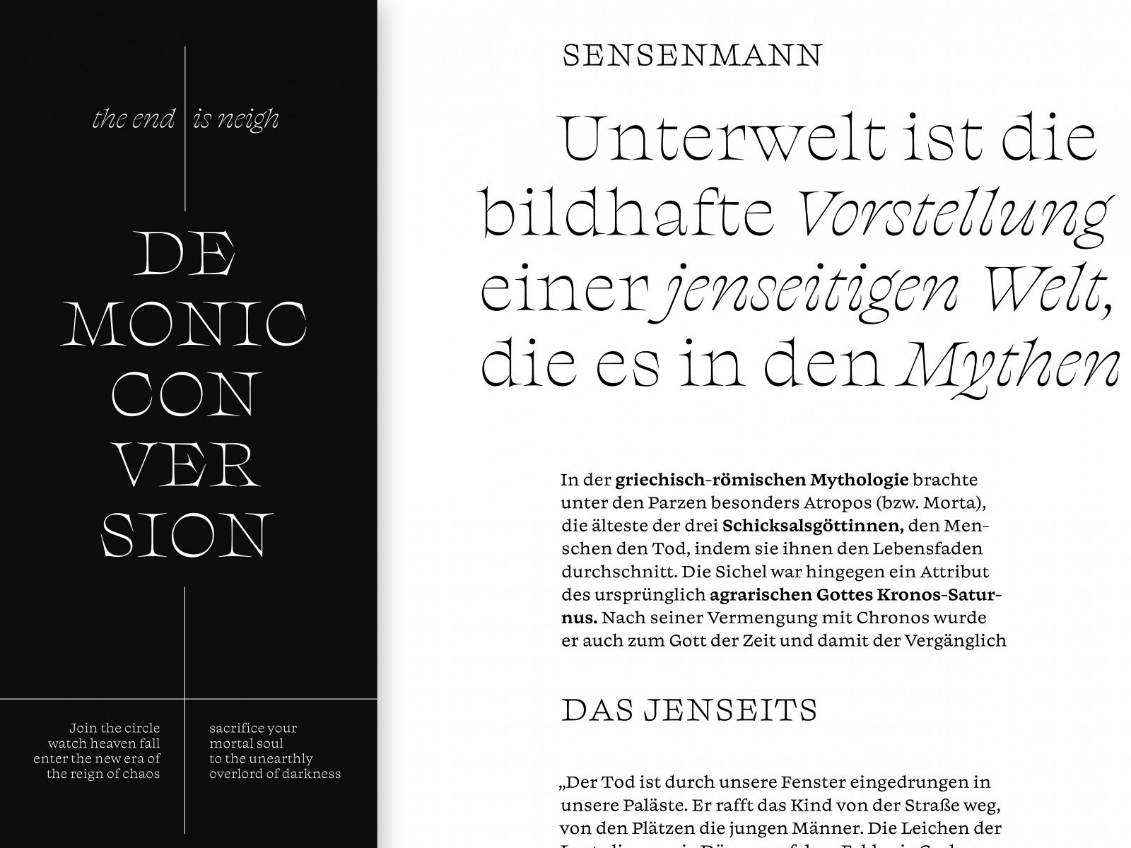
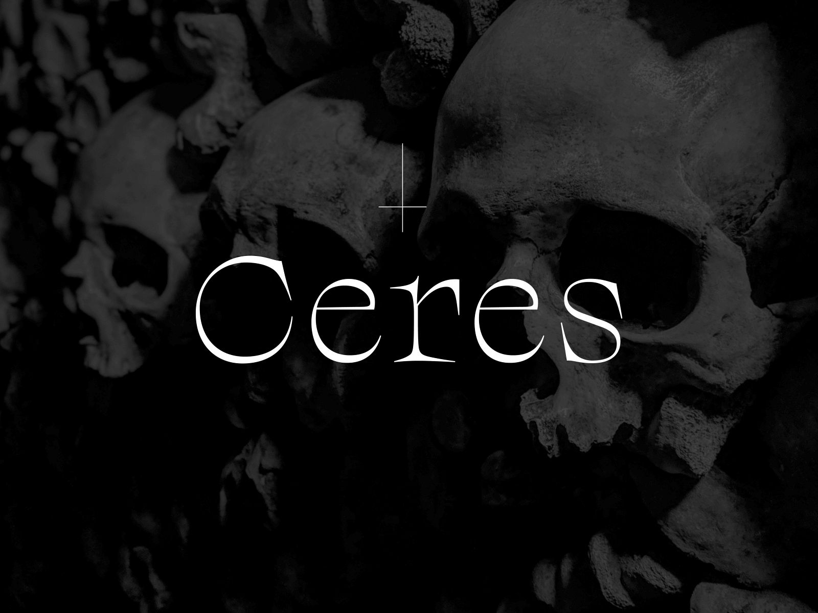
Ceres is a typeface with a macabre atmosphere. My first idea was to give different characters of a story their own typographic voice. I wanted to capture the personification of death, a character in the stories of Terry Pratchett, in a typeface. The plan changed, but the inspiration stayed the same. Ceres developed into a diverse family of five styles: Scythe Roman and Italic for larger sizes, and Sickle Light to Bold for smaller sizes. The Scythe Roman owes its name to the sharply curved serifs, whose shape is slightly reminiscent of a scythe. The Italic, on the other hand, interprets the underlying theme in a completely different way. Its fluid curves with horn-like ends create the wickedly diabolical character. Developing the counterpart for smaller uses was much more challenging. I chose linear details and a sturdier look. While the light weight is an adaption of the Scythe style, but for use in smaller text; Regular and Bold deviate further from the shapes and are specially adapted for longer texts.
