Jovana Jocić is a type and graphic designer from Belgrade, Serbia. Always the loudest one in the room, she is interested in designing Cyrillic and Latin typefaces, but also spends her free time sketching and working on lettering projects. When not in front of the screen, Jovana enjoys the outdoors and is a competitive, passionate skier.

GRADUATION PROJECT
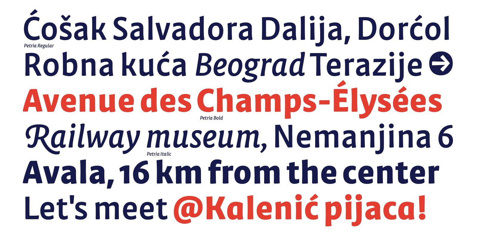
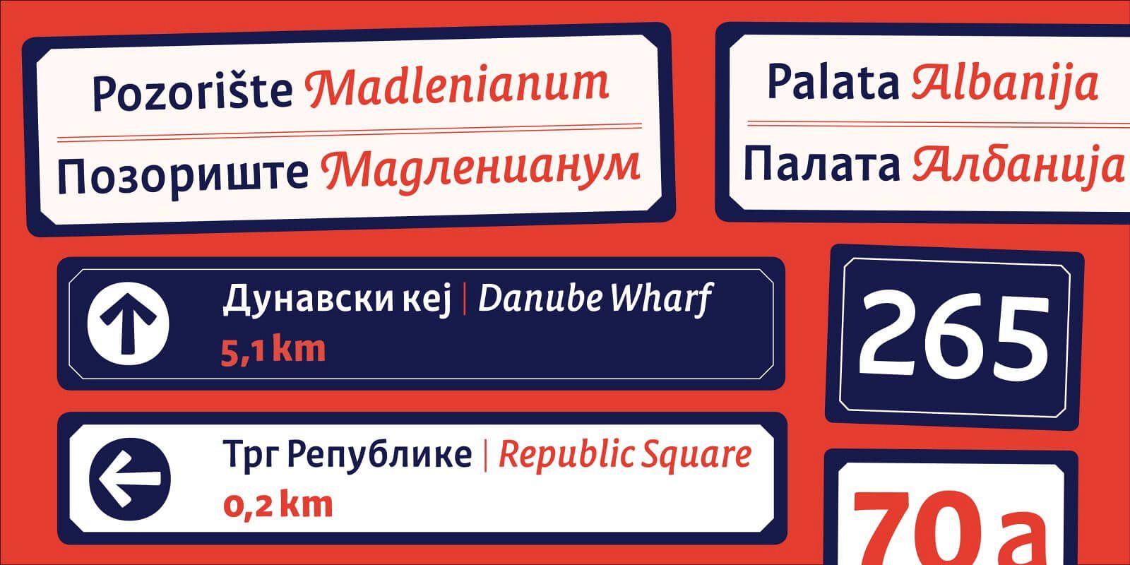
Petria is a signage typeface inspired by old Art Nouveu signs and overall art movement present on the Balkans in the early 20th century. Its Roman and Italic were born out of the idea of designing a type family that would be used for street signage and way-finding for the city of Belgrade, Serbia.
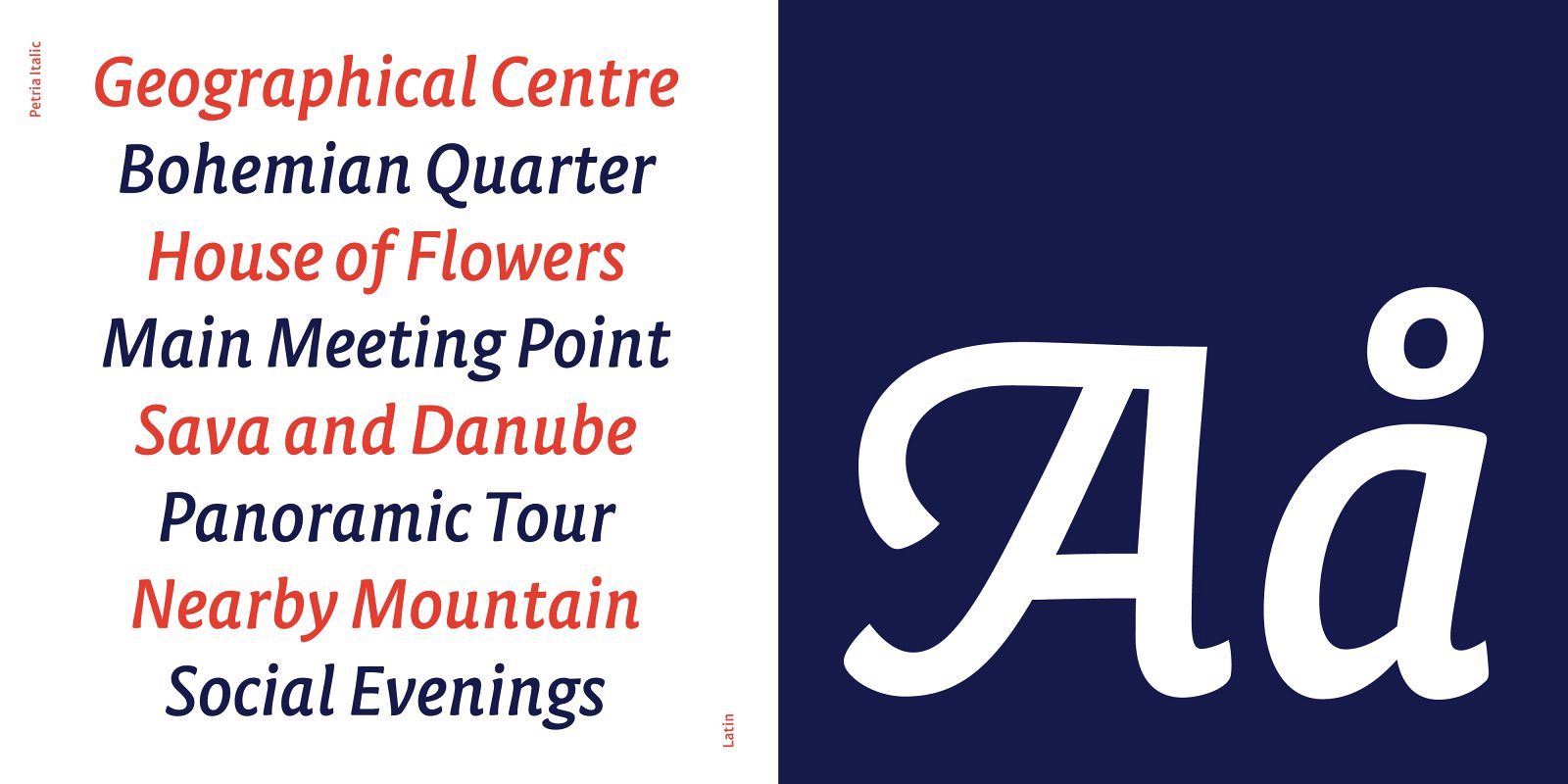
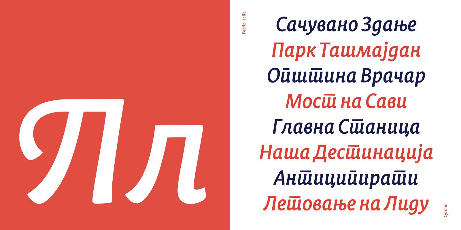
It started out as a typeface where legibility and solving an existing problem of combining two different scripts - Latin and Cyrillic was the main focus, but evolved into successfully depicting its character and rich history. I wanted to treat this typeface as if I was trying to describe a person through letterforms, and capture in essence its character and and all the feelings associated with it. My Type and Media graduation project started out with a clear idea, both when it comes to its aim and application. With my graphic design background, I was used to creating things for a strict purpose, so drawing a typeface that I could treat in a similar way seemed like a promising opportunity to learn what would the essentials for a project like this be. It became a process of understanding how to channel the energy I wanted its shapes to carry, while still serving its initial purpose. While designing Petria, I have decided to shift away from the conventional approach commonly present in street signage – using only capitals, and draw lowercase shapes as distinctive to the human eye as possible. At this moment, Petria consists of a Roman in two weights (Regular and Bold), and a more witty and laid-back accompanying Italic. Both styles cover Cyrillic and Latin script, and the Italic has an entire set of Alternate Swashy Capitals.
