Huw Williams is a type designer from the United Kingdom of Great Britain. As a retired climber, Huw abandoned the rock to live a more sedentary life of black and white, up and down, left and right. Now instead of worrying about friction and two finger pockets, he concerns himself with over obsessive point placements, confusing research proposals and what the French are doing (done).
GRADUATION PROJECT
Malham
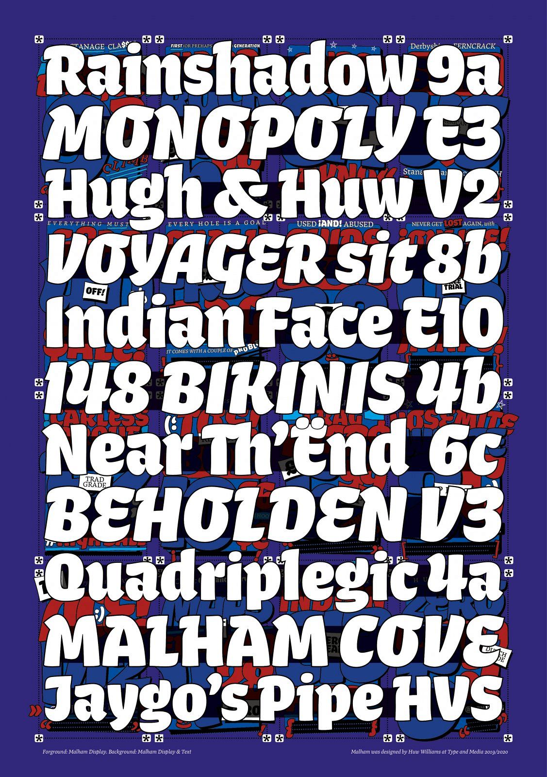
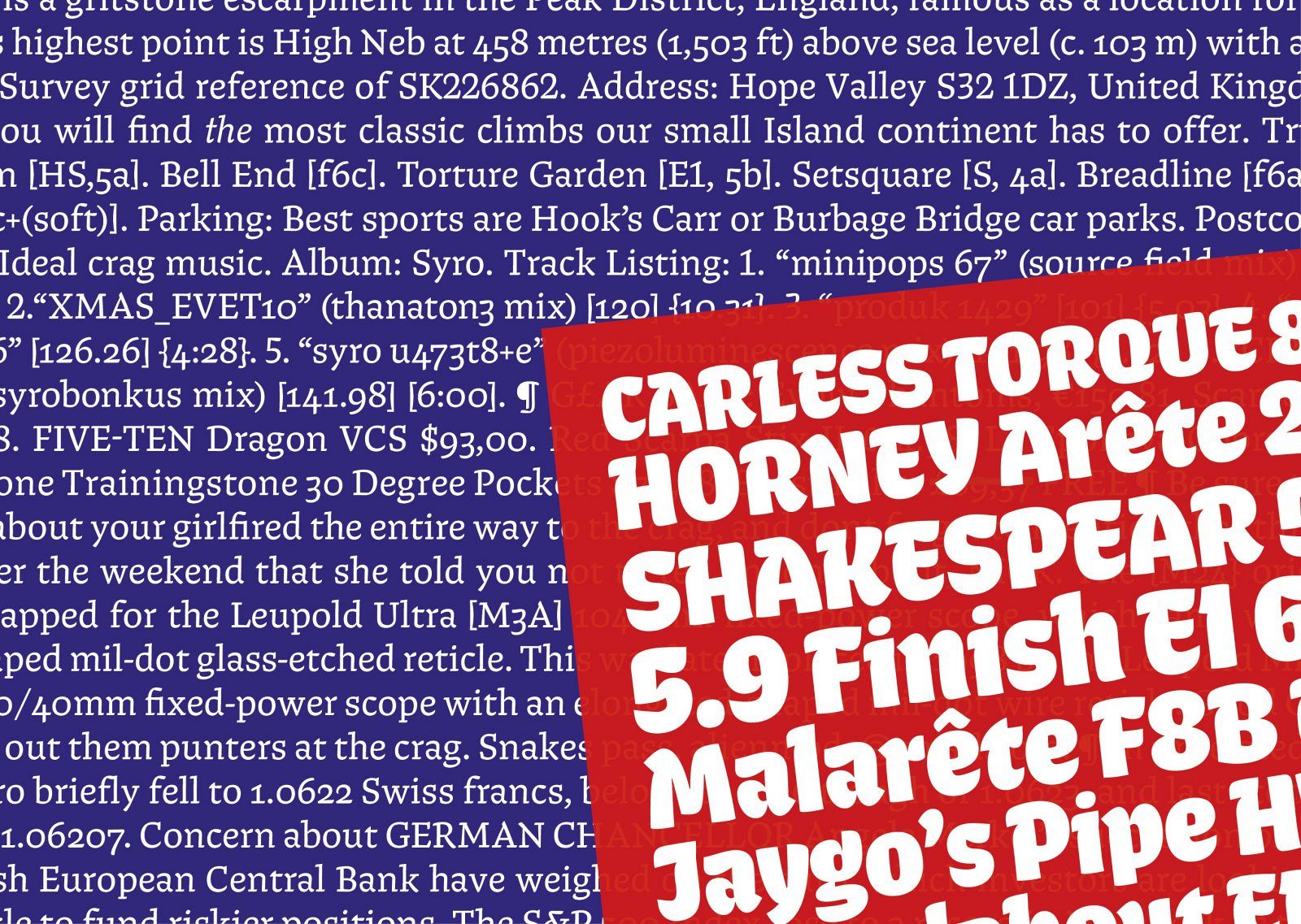
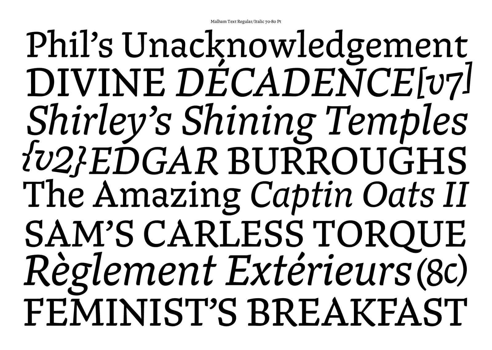
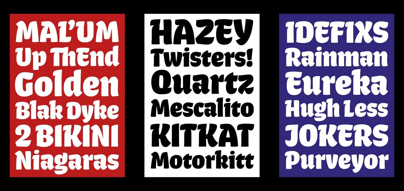
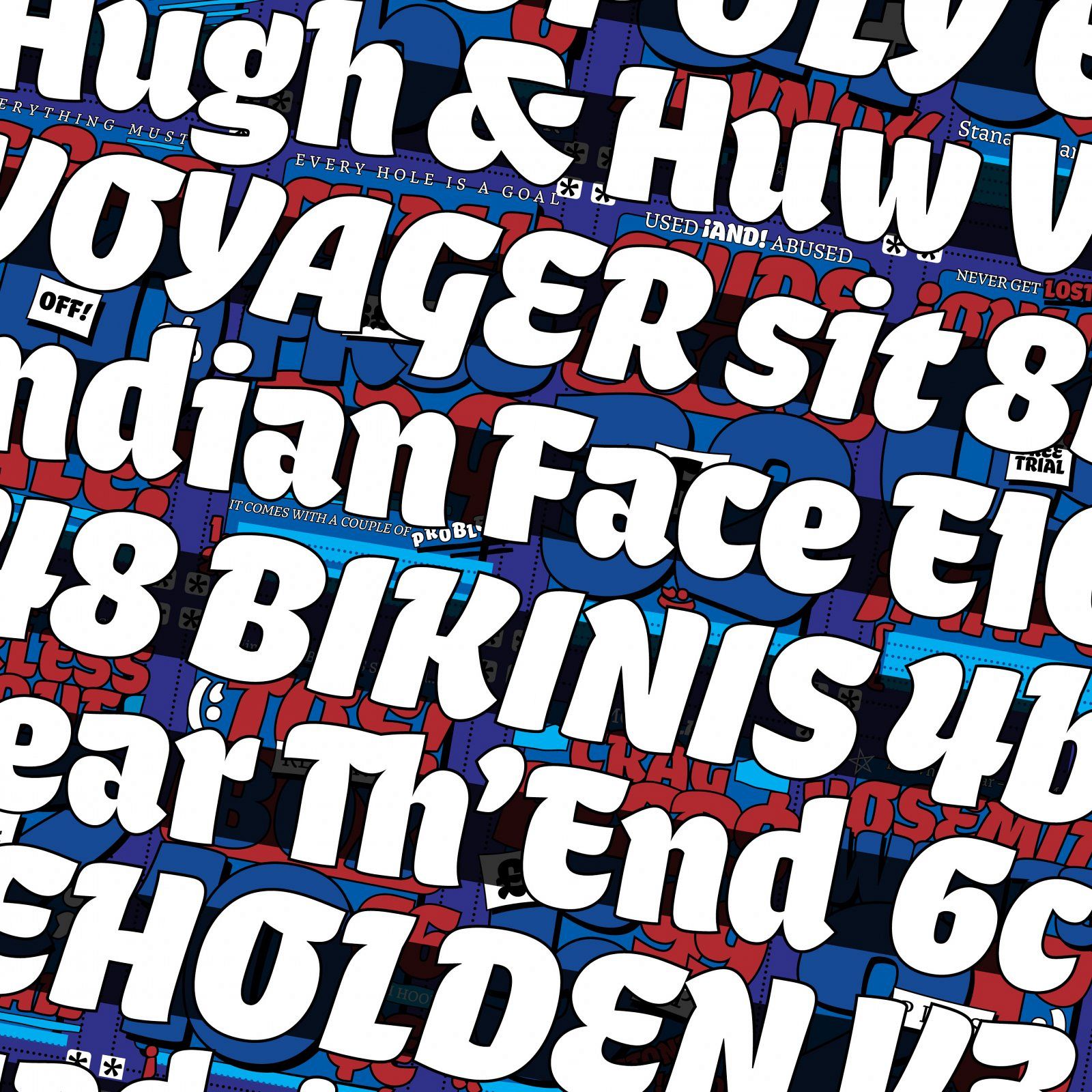
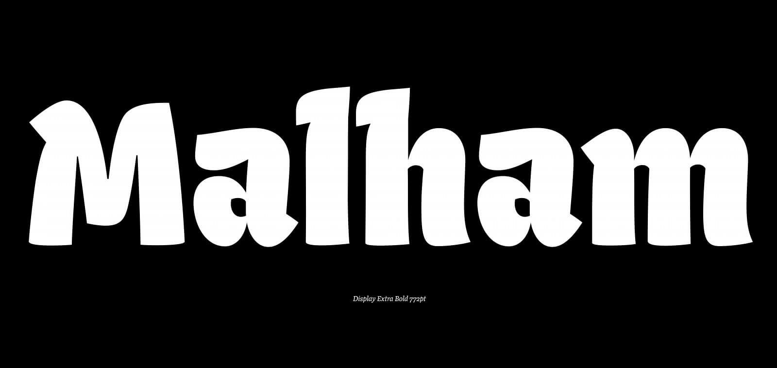
The Malham Type Family
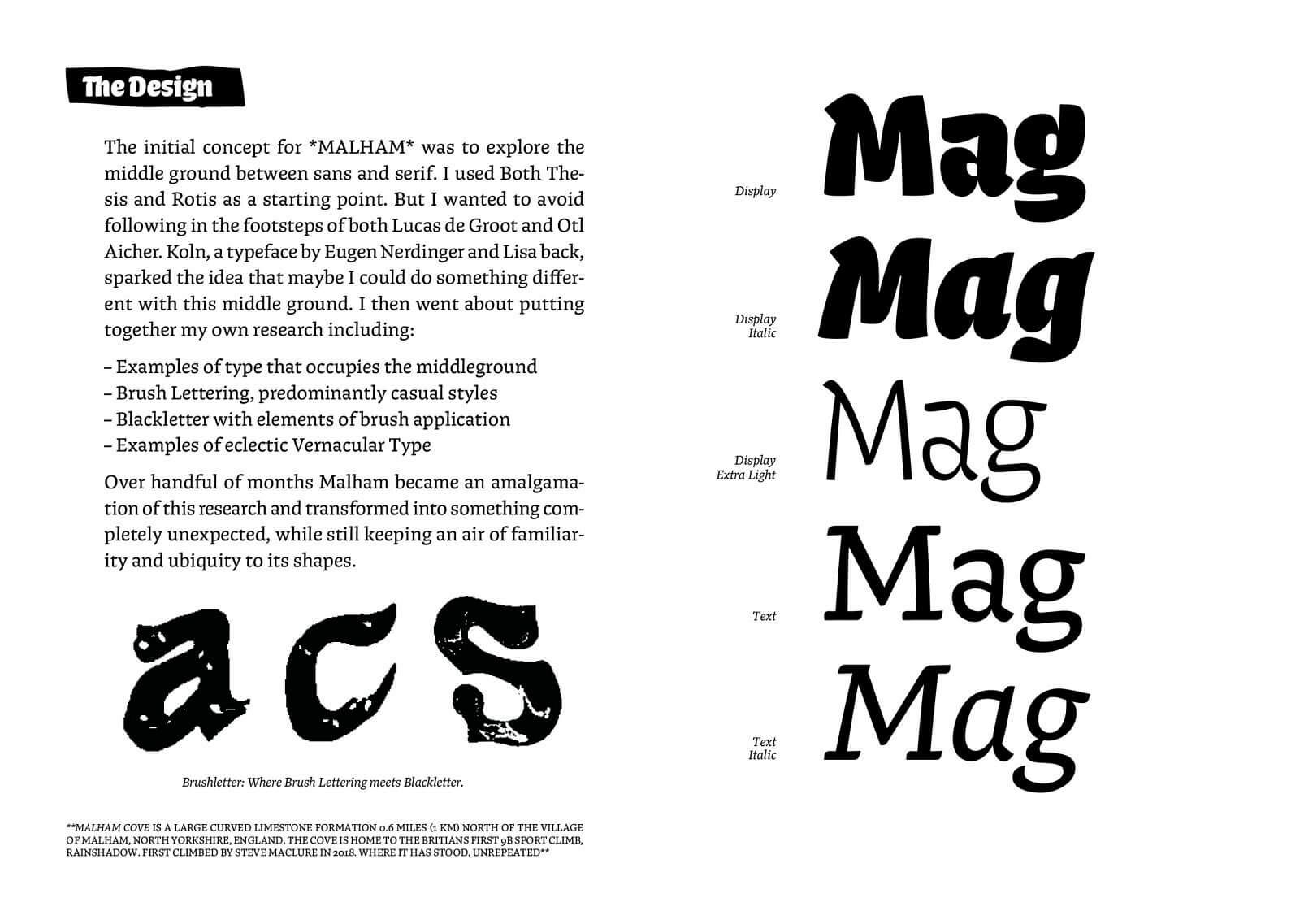
The initial concept for MALHAM was to explore the middle ground between sans and serif. I used Both Thesis and Rotis as a starting point. But I wanted to avoid following in the footsteps of both Lucas de Groot and Otl Aicher. Koln, a typeface by Eugen Nerdinger and Lisa back, sparked the idea that maybe I could do something different with this middle ground. I then went about putting together my own research including:
– Examples of type that occupies the middleground
– Brush Lettering, predominantly casual styles
– Blackletter with elements of brush application
– Examples of eclectic Vernacular Type
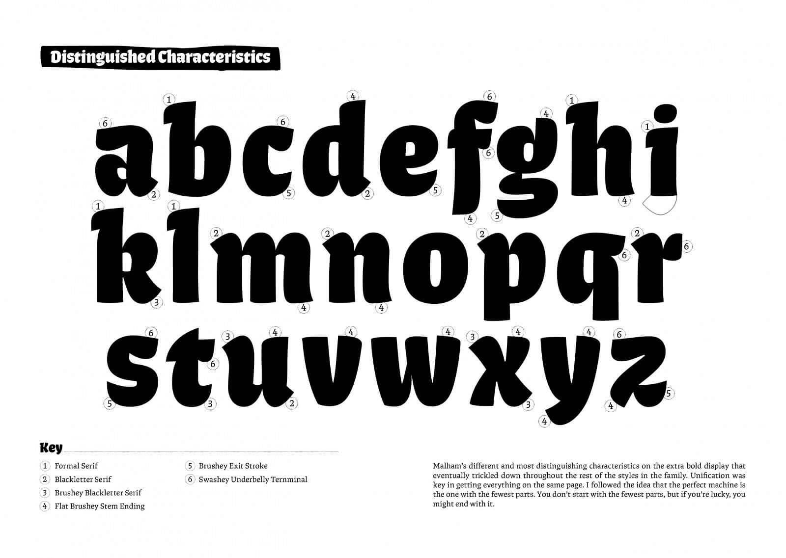
And Over handful of months Malham became an amalgamation of this research and transformed into something completely unexpected, while still keeping an air of familiarity and ubiquity to its shapes.
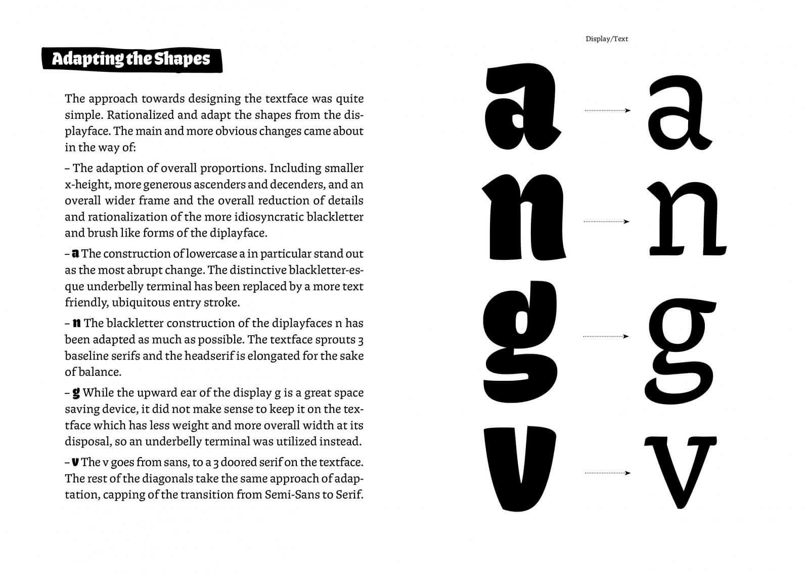
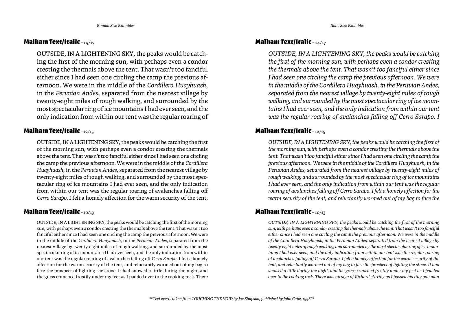
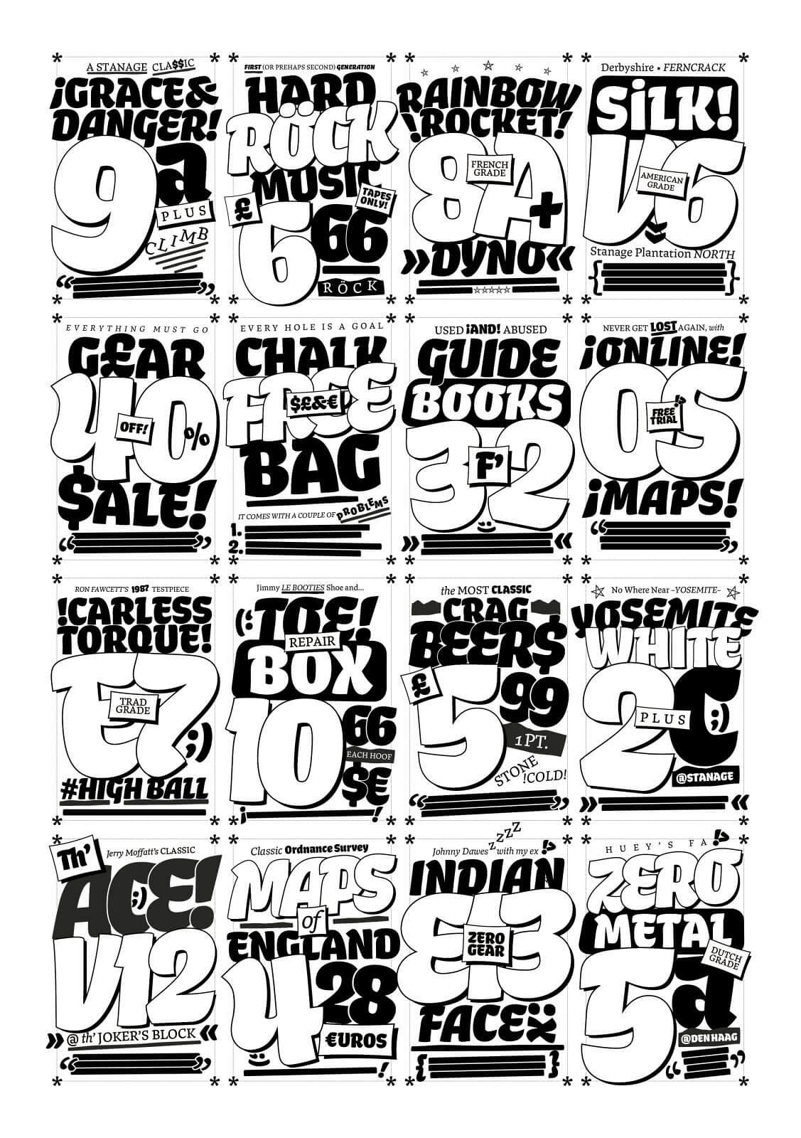
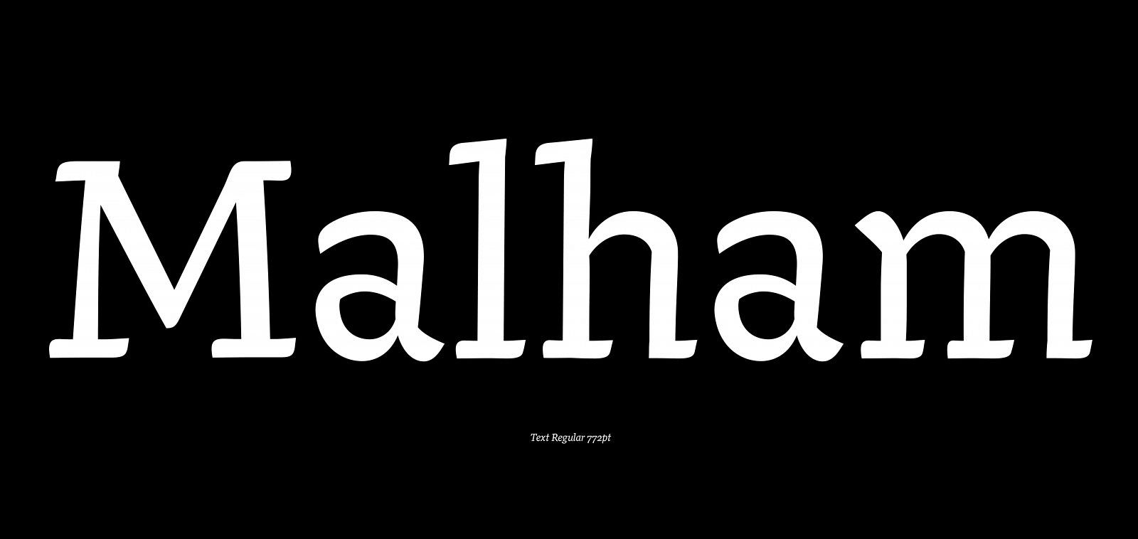
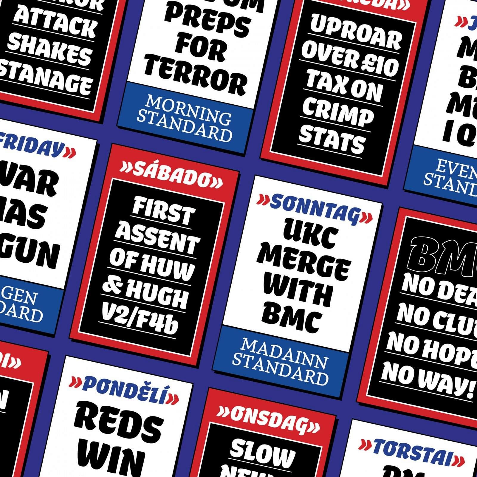
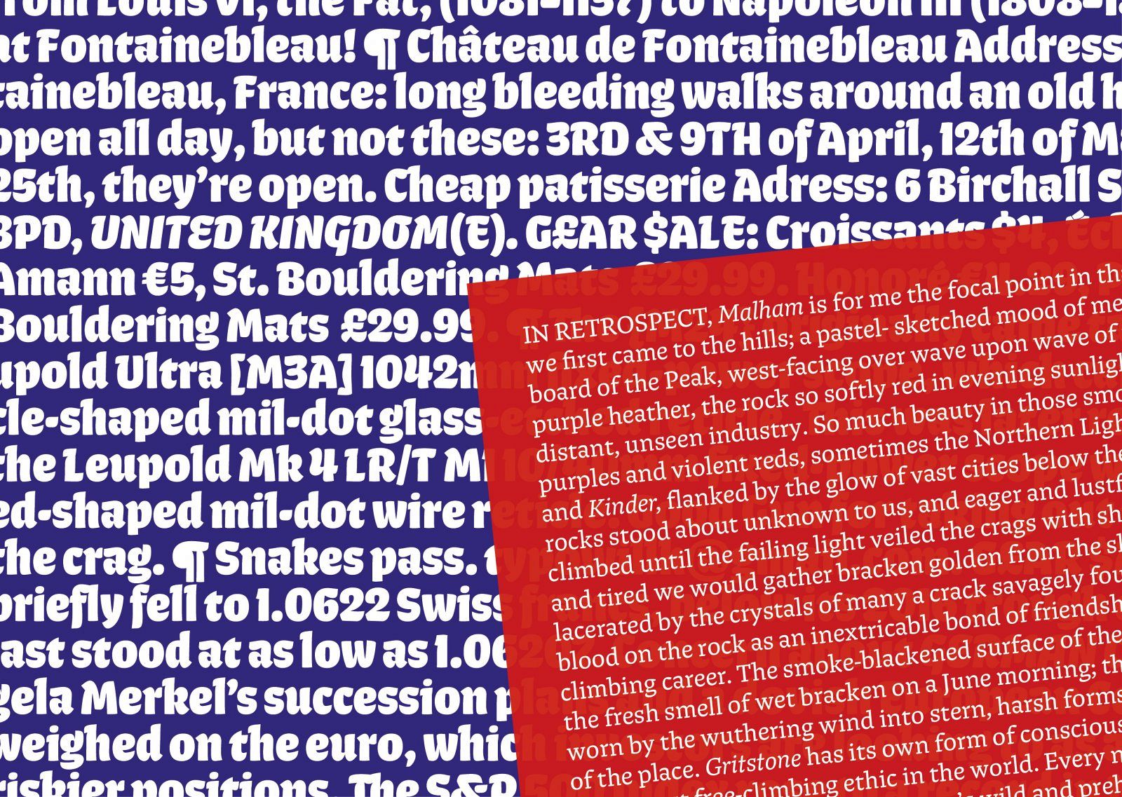
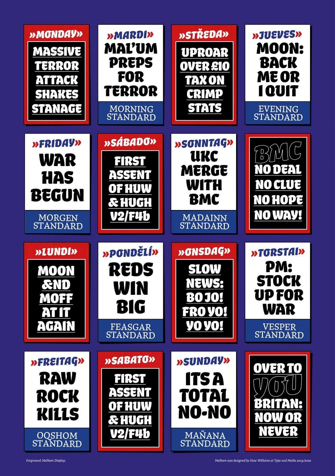
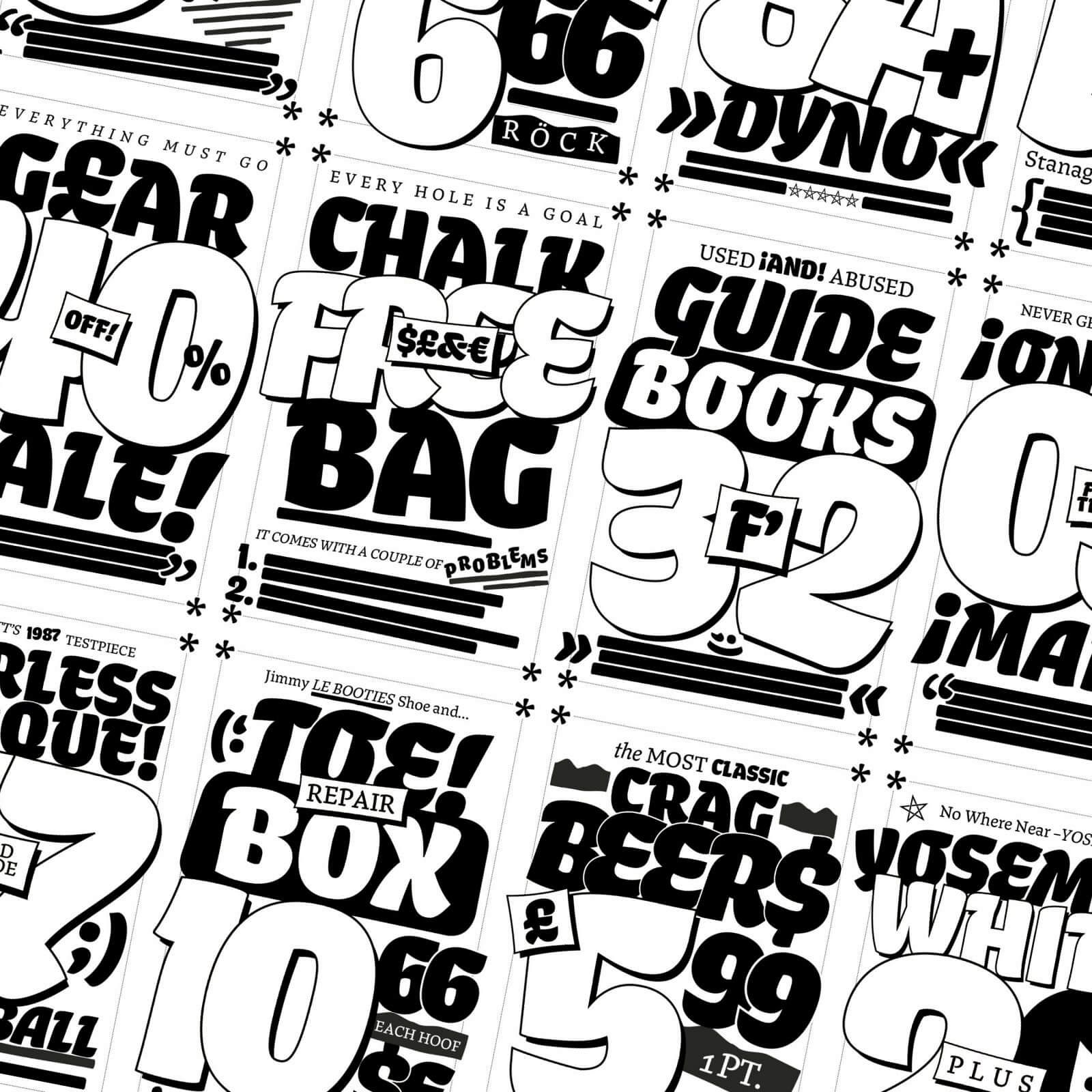
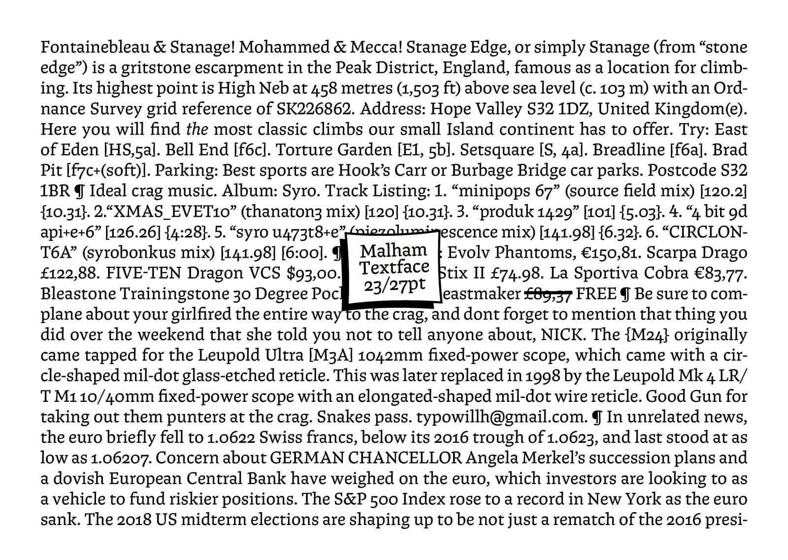
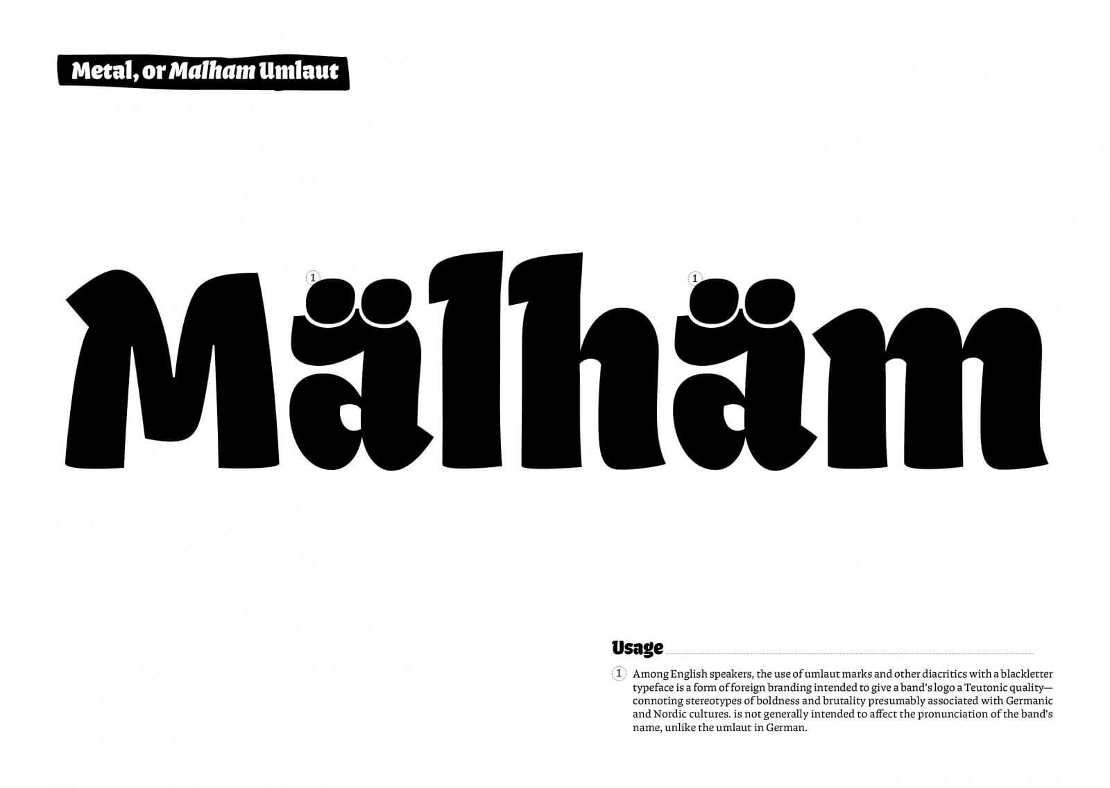
The Malham type family is comprised of two main styles, display and text. The display styles lean heavily on the research that was laid out in the development phase of the project, while the textface adapts the shapes and details of the display to function better at smaller sizes.

