Arnaud Chemin is a French type and graphic designer, just graduated from Master Type]Media in The Hague, Netherlands. He studied applied arts in Reims, then learned print graphic design in Paris, and moved to Ésad Amiens to specialize himself into new media interactions and typography. He also followed a master program at Écal to dedicate himself to type design. He worked at Typofonderie, and Blackfoundry where he was involved in brand identity projects. He is a calligraphy and capital letterforms lover. He likes to deal with huge amounts of work so he needs good organisation to survive. Despite he looks perfect, if you hear somebody typing very loud and fast on a keyboard, that might be him. He also enjoys being grumpy and makes the worst typographic puns ever.
GRADUATION PROJECT
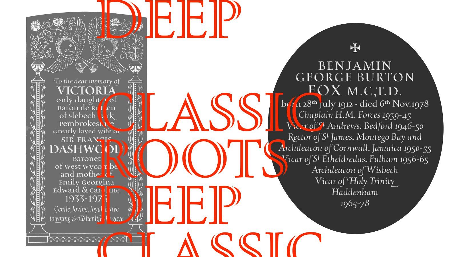
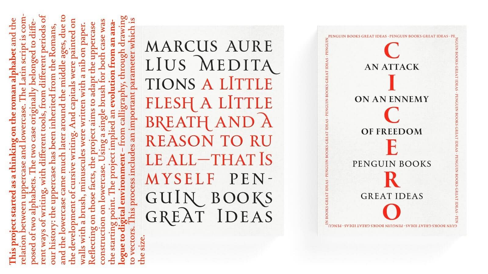
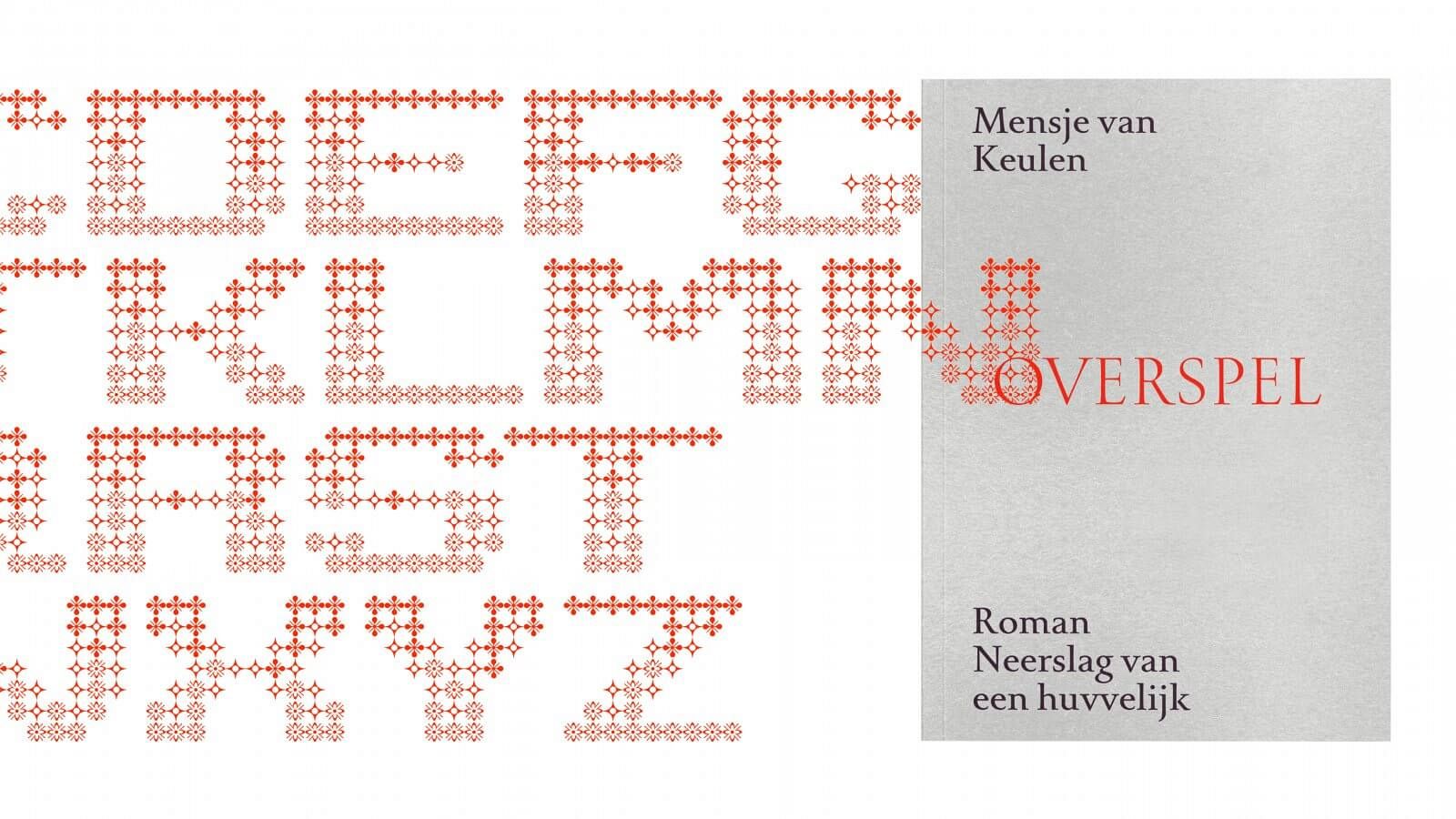
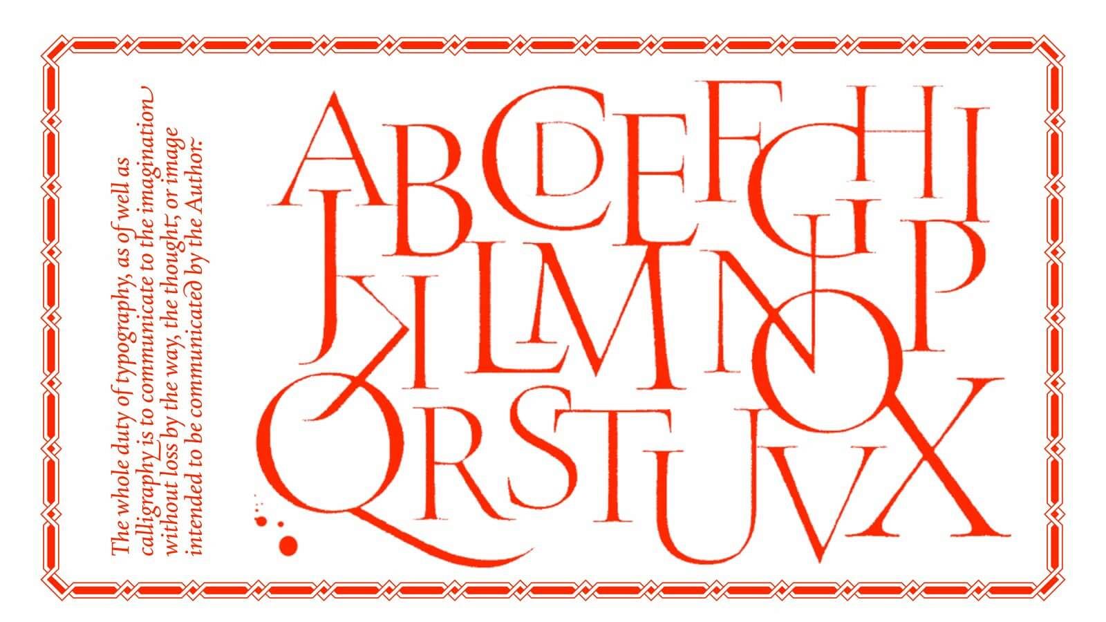
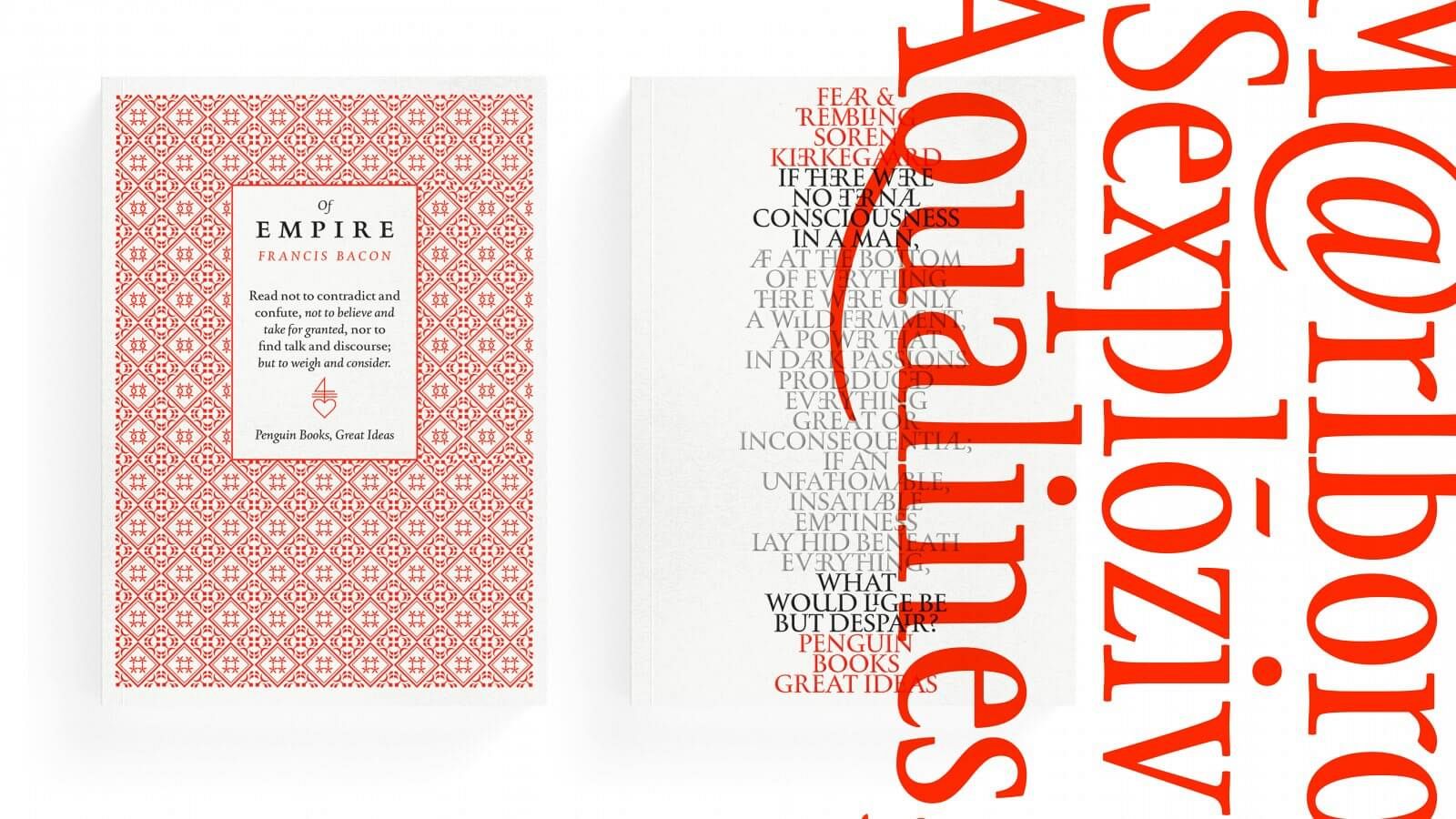
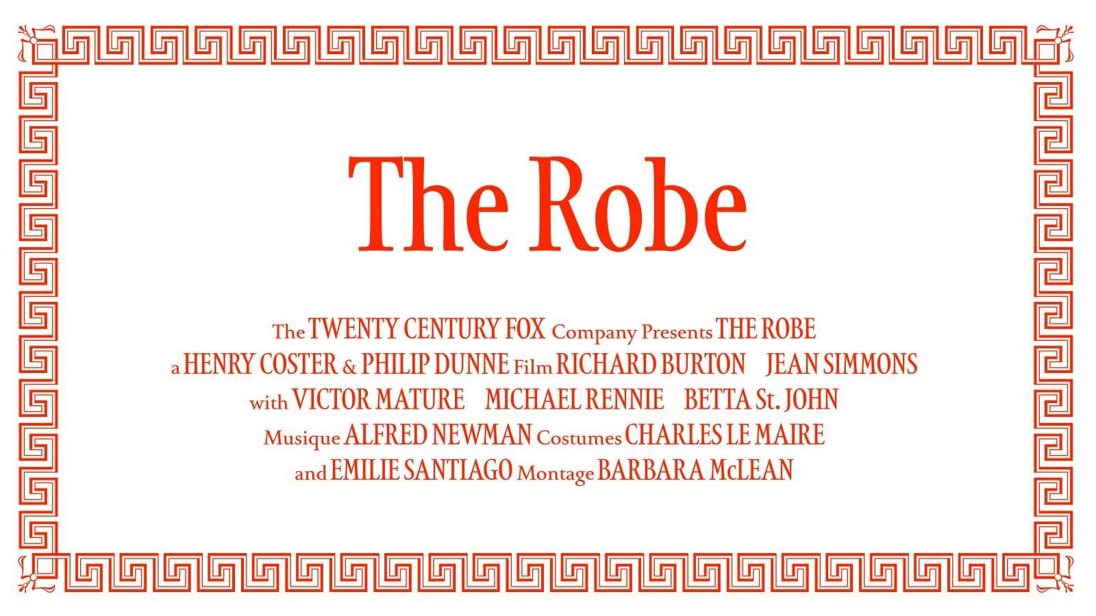
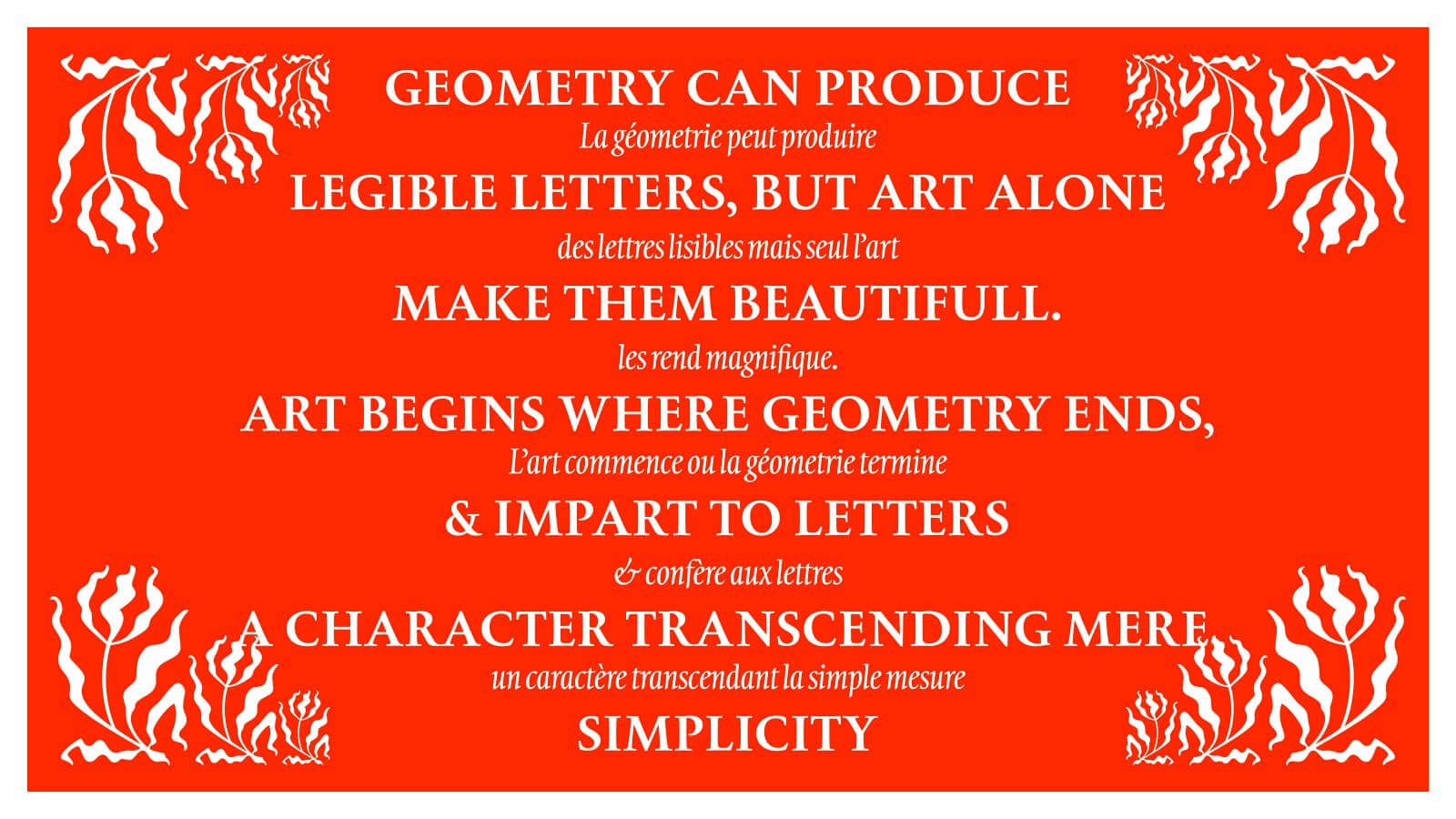
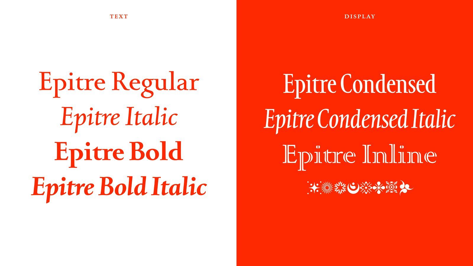
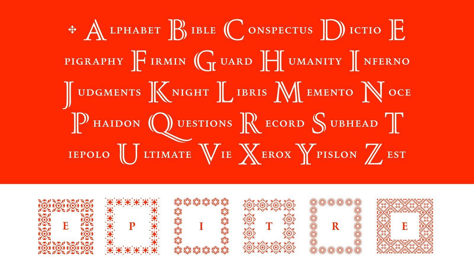
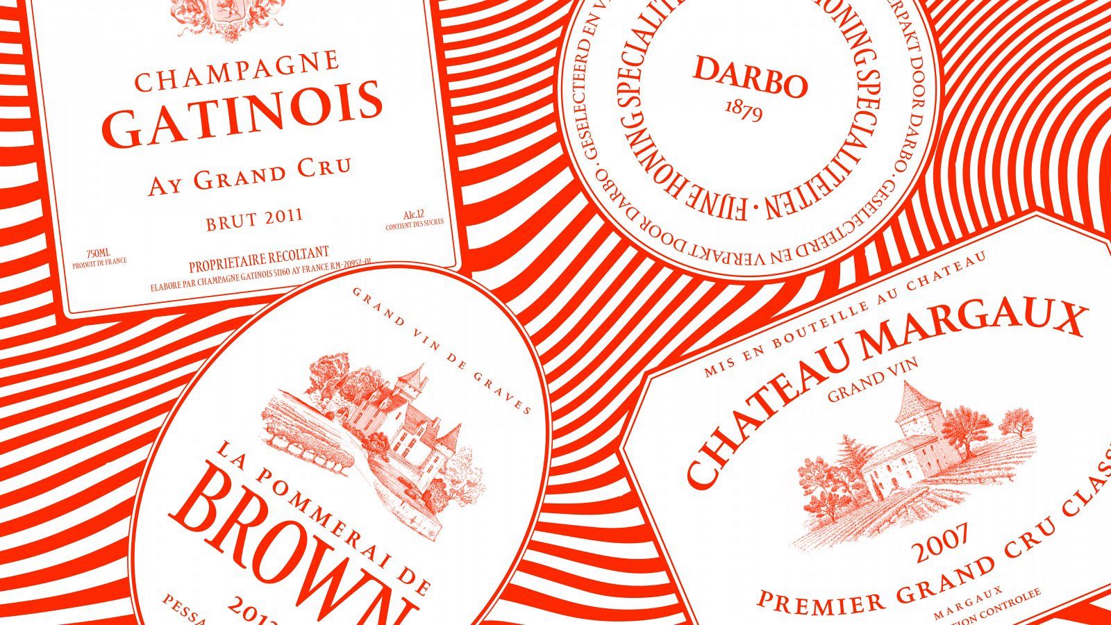
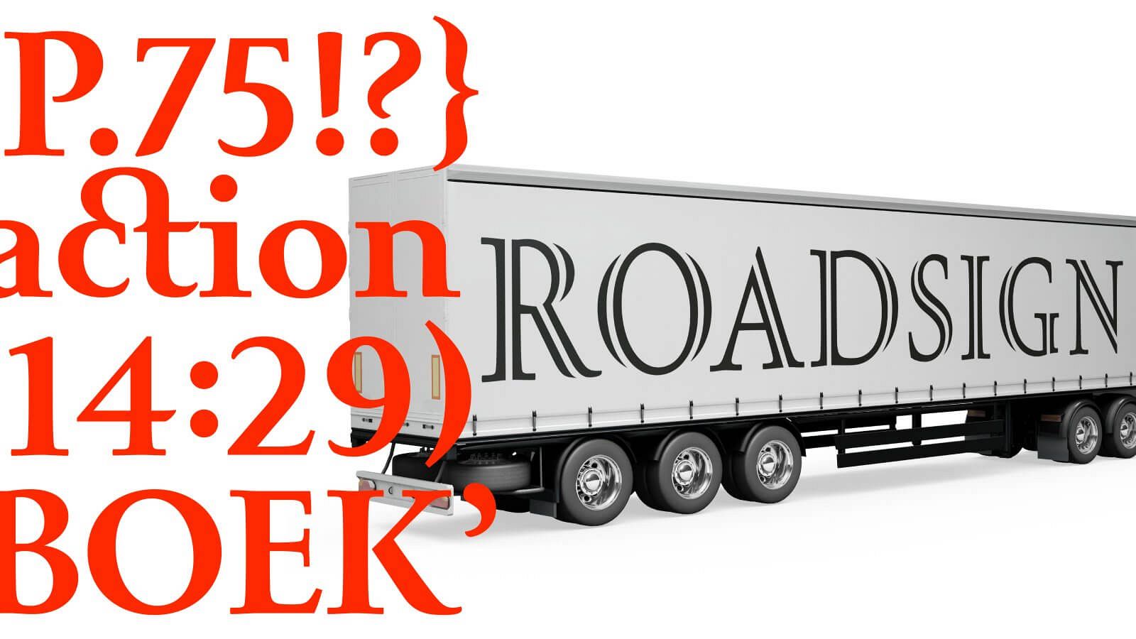
This project started as a reflection on the roman alphabet and the relation between uppercase and lowercase. The Latin script is a bicameral script: we use two alphabets for a given language. Those two alphabets originally belonged to different ways of writing (differ- ent tools), from different periods of our history: The uppercase has been inherited from the Romans, and the lowercase came much later around the middle ages, due to the development of cursive writings. Capitals were painted on walls with a brush, and mi- nuscules were written with a nib on paper. Reflecting on those simple facts, this project aims to reconcile those alphabets in a closer relation. To achieve this, I used a single tool as the basis for both cases: the brush. I adapted the lowercase to the up- percase construction, basing that decision on the fact that one appeared before the other. I also believe that lowercase are more flexible than uppercase, and this might have motivated my choice as well. The project also implies an adaptation from an an- alogue to a digital environment – from calligraphy, through drawing to vectors. This process includes an important parameter which is the size. Calligraphy and lettering behave well in a big size, but many changes had to happen to make a proper text typeface for reading size. I had to fight against the monumental aesthetics of the calligraphic construction I originally made. Somehow those vicissitudes lead me to a very tradi- tional and/or historical approach, sprinkled with an English touch.
